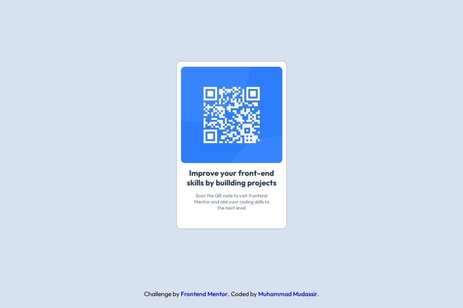
I created this using the CSS BOX Model which is really helpful.
Design comparison
Solution retrospective
I feel very comfortable to do this awesome projects
Community feedback
- @gatep5Posted 4 months ago
Hi @Mudassir-Coder!
Good job on this first assignment! Few things that my help to get your code looking pixel perfect with the design:
-
You can use flexbox to center the card element in the page by applying display: flex to your wrapper class and using justify-content: center, align-items: center, and height: 100vh.
-
Make sure that the width of the main wrapper matches the width from the design file (320px). Also use padding in the wrapper to push the image and the text away from the edge. That way you don't have to specify a width for the img container.
Hopefully you were able to look at the figma design file that was provided. I know I had to reference it to get the drop shadow correct. Great work!
0 -
Please log in to post a comment
Log in with GitHubJoin our Discord community
Join thousands of Frontend Mentor community members taking the challenges, sharing resources, helping each other, and chatting about all things front-end!
Join our Discord