Submitted over 3 years agoA solution to the Four card feature section challenge
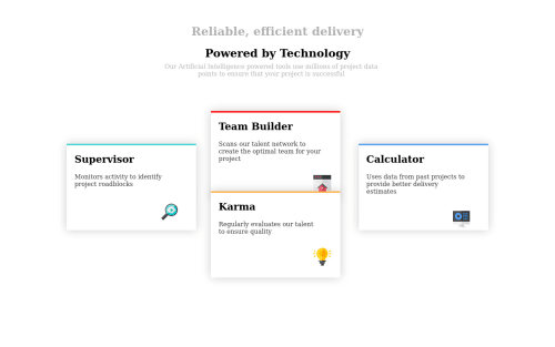
I created this four card feature section using Flex
@MOHITBILALA

Solution retrospective
The first thing I'm confused about when I'm creating this project related to cards is how to fit all the things together and I face a lot of trouble although I do figure it out after lots of research
Code
Loading...
Please log in to post a comment
Log in with GitHubCommunity feedback
No feedback yet. Be the first to give feedback on Mohit Jain's solution.
Join our Discord community
Join thousands of Frontend Mentor community members taking the challenges, sharing resources, helping each other, and chatting about all things front-end!
Join our Discord