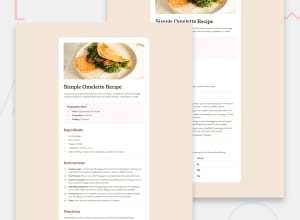
Design comparison
SolutionDesign
Community feedback
- @SmatsherPosted 4 months ago
Your implementation looks great. You can change the color of the list style type with
li::marker {
    color: value;
}
There is also more space between the marker and the text. You also add one more horizontal line after the Fat. You can think of adding more semantic HTML like main or other. I also looked at the mobile design and the image is not rendered as expected. You can achieve this by using
section {
  background: var(--White);
  border-radius: 10px;
  width: 60%;
  margin: 120px auto;
}
In the media query
0
Please log in to post a comment
Log in with GitHubJoin our Discord community
Join thousands of Frontend Mentor community members taking the challenges, sharing resources, helping each other, and chatting about all things front-end!
Join our Discord
