Submitted 6 months ago
I basically use the flex in most of the case cause its a small scale
@Aviral000
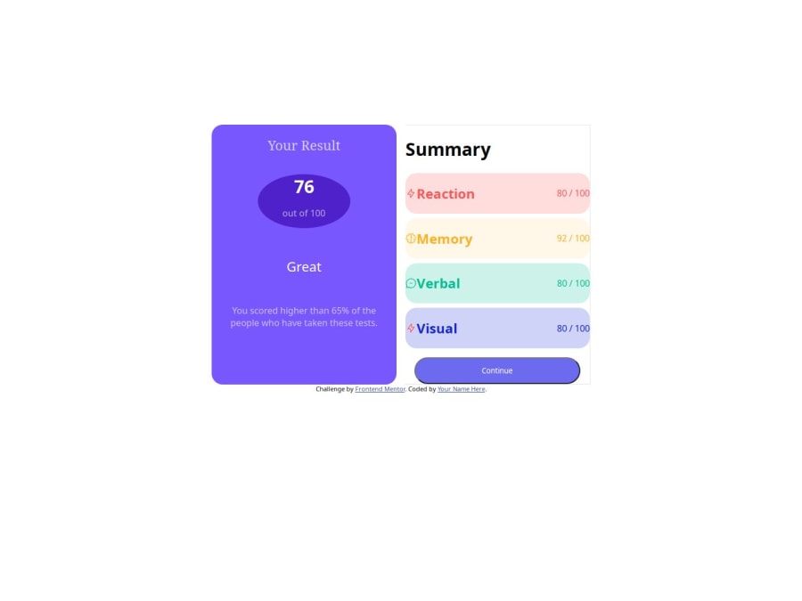
Design comparison
SolutionDesign
Solution retrospective
What challenges did you encounter, and how did you overcome them?
just the media queries
Community feedback
- @giorgigelashvili12Posted 6 months ago
I just finished making this. Everything has worked out for me except for the correct colors and spaces on the left side. Here is it: https://6658c026e7f8115023ef4d66--meek-arithmetic-f662f2.netlify.app/?fbclid=IwZXh0bgNhZW0CMTAAAR2qi5rhl1PptOVTB9C1LamS0QQJ-i6PiOHdJJpQvDHO6M6MdF6Vq_OK_Pg_aem_AY8CR6pajKqJHaCN2To5e9CoRCSSZiiRNbLqxjtEPoI-cLR4rSnmUrh4cXssafq1BQbHQjb6pR4mnAj1elxdgsXp
0@Aviral000Posted 6 months agomake sure to remove the flex for small devices or use flex-col for small devices and use the width-full for small device @giorgigelashvili12
0
Please log in to post a comment
Log in with GitHubJoin our Discord community
Join thousands of Frontend Mentor community members taking the challenges, sharing resources, helping each other, and chatting about all things front-end!
Join our Discord
