Submitted over 2 years ago
I am a newbie i used css flexbox and media qureys for this project.

@ayush111222

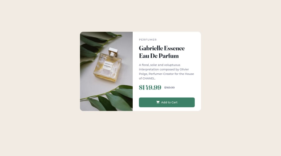
Design comparison
SolutionDesign

Solution retrospective
I want to know how can we give body hight without using 100vh.
Community feedback
Please log in to post a comment
Log in with GitHub
Join our Discord community
Join thousands of Frontend Mentor community members taking the challenges, sharing resources, helping each other, and chatting about all things front-end!
Join our Discord