
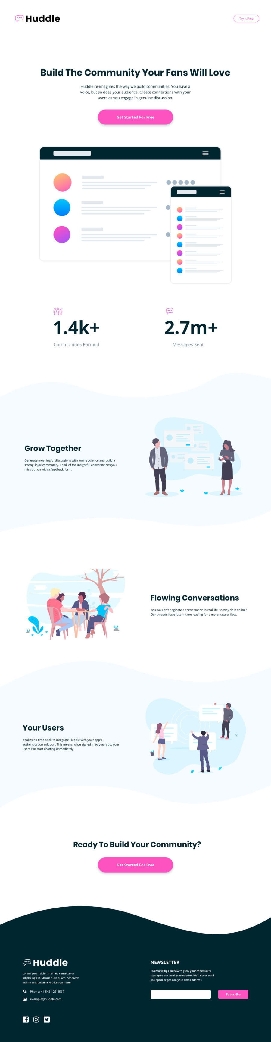
Hunddle Landing Page With Curved Sections - Flexbox


Design comparison
Solution retrospective
I need feedback <3
Community feedback
- @Da-vi-dePosted over 3 years ago
Hi, it could be a great result but the mobile version is not good.
-
You started the desktop version instead the mobile one, doing so means no responsive. I'd recommend following mobile first approach, set the width at
350pxcomplete the project, increase the width (in dev tools) when the layout breaks set breakpointsmin-width: ..., try to respect device size: for tablet500 and something px,768px, over900is desktop. Starting mobile version first is the standard and modern way of working nowdays because layouts can be managed much better, the size is smaller the layout is simpler and you have the structure! -
I'd recommend checking the report, click the link, read what that is about and then try to resolve the issues, you can learn much more about HTML semantic in that way.
Hope it helps a little, keep coding :-)
Marked as helpful1@Alenayc-GitPosted over 3 years ago@Da-vi-de Thank you very much for the advice 😊, I really did not know that the modern standard is mobile firts and with your explanation of using the min-width property to do the Responsive my head exploded because it makes a lot of sense.
I will make the project that way and also correct the semantics of the HTML.
Have a very nice day and happy coding 😊
PD: Sorry if my English is not clear.
1@Da-vi-dePosted over 3 years ago@Alenayc-Git I'm glad my advice helped you a little! Don't be worry about your english, it's very clear, besides english is not my first language either, i make tons of mistakes... Have a nice day you too :-)
1 -

Please log in to post a comment
Log in with GitHub
Join our Discord community
Join thousands of Frontend Mentor community members taking the challenges, sharing resources, helping each other, and chatting about all things front-end!
Join our Discord