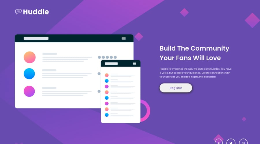


Design comparison
SolutionDesign

Solution retrospective
Didnt know how to responsive it :'(
Please log in to post a comment
Log in with GitHubCommunity feedback
- P@Chriseden83
I find it's best to build using a mobile first approach then use @media adding a breakpoint for different devices but that's my preference.
Take a look at https://www.freecodecamp.org/news/css-media-queries-breakpoints-media-types-standard-resolutions-and-more/ this should give you an insight into responsive design. Kevin Powell also has some great youtube videos on responsive design.
It's best to add the background images inside the CSS file using background-image property as you have one image for mobile and one for desktop devices.

Join our Discord community
Join thousands of Frontend Mentor community members taking the challenges, sharing resources, helping each other, and chatting about all things front-end!
Join our Discord