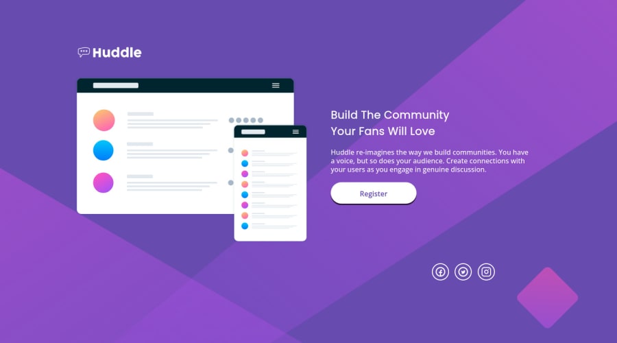
huddle-landing-page-with-single-introductory-section-master
Design comparison
Solution retrospective
Please help me to fish out areas you think I should work on.
Community feedback
- @vanzasetiaPosted about 2 years ago
Hello there! 👋
As you can see from the design comparison, the site looks very different from the original design. So, I would recommend trying to make your site looks as close as possible to the original design.
For the styling, I suggest using
rem
or sometimesem
unit instead ofpx
. Usingpx
will not allow the users to control the size of the page based on their needs. I recommend reading this tutorial article aboutrem
andem
unit. This article explains both units in a simple way. I recommend reading it if you're not confident to use those units.I hope this helps! 🙂
Marked as helpful1 - @correlucasPosted about 2 years ago
👾Hello Oyasi Kelly, Congratulations on completing this challenge!
1.You've done the design for the wrong image, when you download the starter files the folder comes with 3 files (preview card, desktop and mobile) you've created the solution based on the
preview
and you should consider only themobile + desktop images
.Remove the
background-color
from the container and add it to thebody
to make sure this color background will display it full screen.@media screen and (min-width: 1000px) body { /* background: var(--Violet) url(./images/bg-mobile.svg); */ background-size: cover; padding: 0px 0px; background-repeat: no-repeat; background: var(--Violet) url(./images/bg-desktop.svg); } body { background-color: var(--Violet); background-size: cover; background-repeat: no-repeat; padding: 150px auto; }
The button have a shadow too much flat and dark, you can improve it increasing the
blur
and decreasing theopacity
. Here's the correct value:box-shadow: 8px 8px 20px 0px rgb(24 10 24 / 25%);
✌️ I hope this helps you and happy coding!
0 - @mauricio-fontouraPosted about 2 years ago
Hello Friend, how are you
Try structuring your HTML as blocks for example:
body{
<main class=" wrapper> <section class="container-showImage" <div> <img src=""> </div> <h1>Title</h1> <p>Lorem... </p> </section> <section class="other-block"> So follows the flow of the structure </section> </main> </body>With this structure you can have a much better handling and so you can build good and responsive grids.
hope it helps friend!!!
Com essa estrura você consegue ter uma manipulação muito melhor e assim você consegue construir bons grids e resposive. deixo aqui um tutorial que pode te ajudar muito. Espero que ajude amigo!!!
https://www.youtube.com/watch?v=rg7Fvvl3taU
0
Please log in to post a comment
Log in with GitHubJoin our Discord community
Join thousands of Frontend Mentor community members taking the challenges, sharing resources, helping each other, and chatting about all things front-end!
Join our Discord