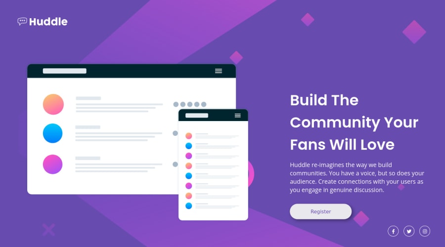
huddle-landing-page-with-single-introductory-section-master
Design comparison
Solution retrospective
Hello,
All feedback is highly appreciated. :D
Thank you.
Giorgian
Community feedback
- @vanzasetiaPosted over 1 year ago
Hi, Vatra Giorgian! 👋
I recommend importing both font families with one
<link>tag. It is possible to import multiple Google Fonts at the same time.Alternative text for the logo should not be "logo". Keep in mind that any words that are related to "image" (for example, picture, photo, logo, icon, graphic, and avatar) should not be included in alternative text.
The alternative text for the logo should be "Huddle".
I think the register button should be a link, not a
<button>element. I think it will navigate the users to a sign-up page.For your information, anchor tags are for navigation. The
<button>element is for an action like opening a modal, submitting a form, toggling an element, etc. It is essential to use the correct elements.The social media icons should be wrapped in anchor tags. They are social media links of the company.
I hope my suggestions help you. Happy coding! 😄
Marked as helpful1
Please log in to post a comment
Log in with GitHubJoin our Discord community
Join thousands of Frontend Mentor community members taking the challenges, sharing resources, helping each other, and chatting about all things front-end!
Join our Discord
