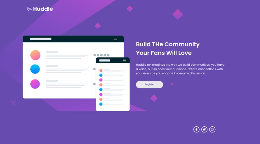
huddle-landing-page-with-single-introductory-section-master
Design comparison
Solution retrospective
i had problems to center the icons
Community feedback
- @HassiaiPosted almost 2 years ago
Wrap <div class="logo"> and <div class="container"> within the main tag and <div class="icons"> in the footer tag to fix the accessibility issues. click here for more on web-accessibility and semantic html
wrap the icons in the ul tag and li instead of separate divs
There is no need to give the body a width and height value. Change the value of the background-size to cover.
For the left and right sides space of the page, give the main and the footer a max-width of 1440px, a width of 80% and margin:0 auto.
main, footer{
max-width:1440px;
width:80%;
margin: 0 auto;
}
To center the icons change the value of the justify-content to center.
Use relative units like rem or em as unit for the padding, margin, width values and preferably rem for the font-size values, instead of using px which is an absolute unit. For more on CSS units Click here
Hope am helpful.
Well done for completing this challenge. HAPPY CODING
0
Please log in to post a comment
Log in with GitHubJoin our Discord community
Join thousands of Frontend Mentor community members taking the challenges, sharing resources, helping each other, and chatting about all things front-end!
Join our Discord
