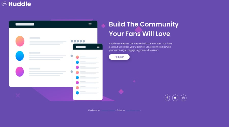
huddle-landing-page-with-single-introductory built html and css
Design comparison
Solution retrospective
all feedbacks are welcomed specifically for the background images and others, thanks.
Community feedback
- @DesignAssemblyPosted over 3 years ago
Congratulations on your attempt to complete this project. Just looking through the site and code there are obvious glaring issues at hand. I would suggest you better familiarize yourself with concepts such as flex-box and understanding responsive design. Look at your solution vs the design and you will see you need to try to correct a couple of things in the layout.
One tip I can give you is to not set fixed widths to images but rather set with to 100% and the parent container holds the "width parameter for you to adjust. Before you even touch code look at the design and do a rough sketch of how you think you could set up your "containers and padding" to get the layout to look the same as the design, once you have that in place the rest becomes cosmetics.
You asked about your background image - firstly it is on the wrong container - maybe think of creating a wrapper container just below the body container that holds everything else. then set the background image on this container. tip - background-size is not contain :)
Happy Coding
0
Please log in to post a comment
Log in with GitHubJoin our Discord community
Join thousands of Frontend Mentor community members taking the challenges, sharing resources, helping each other, and chatting about all things front-end!
Join our Discord