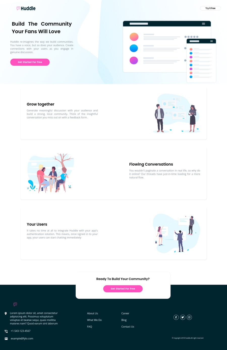
huddle-landing-page-with-alternating-feature-blocks-master
Design comparison
Solution retrospective
i need reviews on this
Community feedback
- @MelvinAguilarPosted almost 2 years ago
Hello there 👋. Good job on completing the challenge !
I have some suggestions about your code that might interest you.
- A logo is not considered a decoration in HTML because it is often a crucial part of a website's branding and identity, use company name as the alt attribute value for logos.
- In this challenge it is not necessary to use the
<nav>tag in the header. The<nav>tag is used to define a section of a webpage that contains navigation links. It is typically used to group together links to other pages or to different sections of the current page.
-
Social media icons, which are often used to link to a company's social media profiles, should typically be anchor elements because anchor elements allows users to easily click on the icon and be taken directly to the company's social media profile page. This makes it easy for users to connect with the company on social media.
Additionally, you should use the
aria-labelattribute to describe the links if they don't have visible text
- In the footer, the paragraphs
About Us,What We Do,FAQ,Career,BlogandContact Usshould be links within an unordered list.
- Use more descriptive class names to improve readability of front-end code. You can use BEM naming convention to improve your class names.
- Instead of using pixels in font-size, use relative units like
emorrem. The font-size in absolute units like pixels does not scale with the user's browser settings. You can read more about this here 📘.
I hope you find it useful! 😄
Happy coding!
0
Please log in to post a comment
Log in with GitHubJoin our Discord community
Join thousands of Frontend Mentor community members taking the challenges, sharing resources, helping each other, and chatting about all things front-end!
Join our Discord
