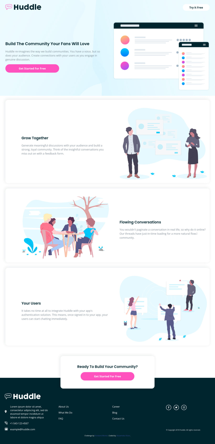
huddle-landing-page-with-alternating-feature-blocks
Design comparison
Solution retrospective
I would really appreciate and love if I can get some feedback from the community.
Community feedback
- @VCaramesPosted over 2 years ago
Hey @olisa187, great job on this project!
Some suggestions to improve you code:
- To make your content semantically correct, you want to set up your code in the following manner:
 <body>
      <header>
        <nav></nav>
        <section>Build The Community Your Fans Will Love</section>
      </header>
      <main>
        <section>Grow Together</section>
        <section>Flowing Conversations</section>
        <section>Your Users</section>
        <section>Ready To Build Your Community?</section>
      </main>
      <footer></footer>
    </body>
The <section> element is for grouping together a single part of the page that constitutes one single piece of functionality .
Source:
https://developer.mozilla.org/en-US/docs/Web/HTML/Element/section
-
For your headings, the hero section always starts with the <h1> heading.
-
To make you content accessible to your users, it is a best to use rem/em instead of px for your CSS property values. For media queries, I definitely suggest using em for them. By using px your assuming that every users browser (mobile, tablet, laptop/desktop) is using a font size of 16px (this is the default size on browser). Em's will help with users whose default isn't 16px, which can sometimes cause the your content to overflow and negatively affect your layout.
Sources:
https://betterprogramming.pub/px-em-or-rem-examining-media-query-units-in-2021-e00cf37b91a9
- While having interactive content (cards, links, icons, buttons, etc…) can definitely make content less static, if not done properly, it can actually have negative effect on your users experience. By simply just applying a “hover” effect to your content, you’re assuming that every device is compatible with “hover” effects. Unfortunately, most devices are not. To provide your users a better experience, you can use the @media (hover: hover) . Now users that that are devices that are not “hover” compatible will be able to enjoy your content.
Sources:
https://css-tricks.com/solving-sticky-hover-states-with-media-hover-hover/
Happy Coding!
Marked as helpful1
Please log in to post a comment
Log in with GitHubJoin our Discord community
Join thousands of Frontend Mentor community members taking the challenges, sharing resources, helping each other, and chatting about all things front-end!
Join our Discord
