Submitted over 2 years ago
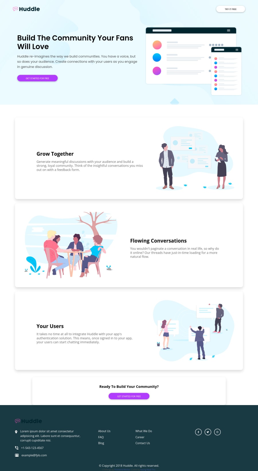
Huddle-landing-page-with-alternating-feature-blocks
@HarutoAmakawa
Design comparison
SolutionDesign
Community feedback
- @Bayoumi-devPosted over 2 years ago
Hey Haruto, It looks good!... You have some
accessibility issuesthat need to fix.Heading levels should only increase by one, Useh2instead ofh3and Useh3instead ofh4...Ordered headingsmake it easier to navigate and understand when using assistive technologies.Links must have the discernible text,Set the attributearia-labelto describe the link. Example:
<a href="#facebook" aria-label`="facebook profile"> <i class="fa-brands fa-facebook-f"></i> </a>- I suggest you don't use
<button>with<a>...
So When to use the
buttonand when to use theanchor link???!... It depends on what you want to happen after clicking... will it redirect the user to another page or section, Use theanchor link<a> Otherwise, use thebuttonButtonsare used for actions like opening or closing something or sending a form.Linksare used for navigation and actions.
I hope this is useful to you... Keep coding👍
Marked as helpful0
Please log in to post a comment
Log in with GitHubJoin our Discord community
Join thousands of Frontend Mentor community members taking the challenges, sharing resources, helping each other, and chatting about all things front-end!
Join our Discord
