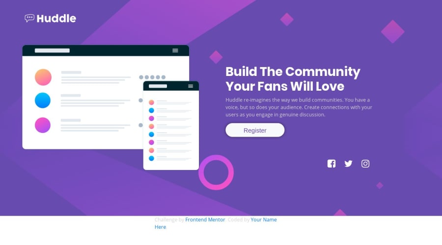


Design comparison

Solution retrospective
how much would you give it out of ten? 1)what should i focus on to make this page more appealing?
2)thing i should take care of while making a responsive page in future?
3)in mobile design the heading and the paragraph need to be in center while in desktop design it should be left align is there and way to achieve that without using media property?
Community feedback
- @GerbenDolPosted over 4 years ago
Hey Siddhant! So, I'd give your solution a 7.5 out of 10. 💪🏻
I think this challenge would be excellent practice to add some nice animations, such as a fade-in to your content! That would really make it more appealing to me! 😁
In the future keep a couple things in mind when making the page responsive:
- The browser will usually scale in ratio, so not only is the page getting less wide, it's also growing less tall. On a smaller screen your image fills the full width and height of the window which is a bit much! Try adding a
max-widthto the image so the text below it, which is important, doesn't get lost off screen. 🤓 - Try keeping your spacing more consistent. There's only a tiny bit of white space above the logo and a lot above and underneath the image. Try to find a vertical rythem in your spacing.
- Decrease the font-size of your headings to make them more readable. The heading gets spread over a bunch of lines.
I don't really see an easy way of centering the text on one set of screens and aligning them to the left on others without using media queries, but I don't see any reason you'd want this anyway! This is what media queries are made for. 😁
Thanks for your great solution, and keep asking this more specific feedback! It's really helpful for me to know what people are interested to learn more about in the feedback. 🤓
1 - The browser will usually scale in ratio, so not only is the page getting less wide, it's also growing less tall. On a smaller screen your image fills the full width and height of the window which is a bit much! Try adding a
- @rcarlosalbaPosted over 4 years ago
Well done!
great job!
Check your "register" button is center vertical.
0


Please log in to post a comment
Log in with GitHub
Join our Discord community
Join thousands of Frontend Mentor community members taking the challenges, sharing resources, helping each other, and chatting about all things front-end!
Join our Discord