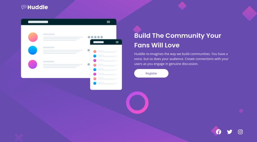
Design comparison
Community feedback
- @NabilWasirPosted over 2 years ago
Here is how you can improve:
-
Using
<main></main>instead of<picture></picture> -
Use the similar icons given in the design and wrap them in a
<div></div>container and give the div border of the icon color to have the circle shown in the design around the icons. -
You have also forgotten the hover states on the button and icons. You can apply the hover effect using the
<svg></svg>given in the icon file itself, you just have to click the icon file to get the<svg></svg>of that icon. Then in CSS use:svg path { fill: white; (you can use the color of the icon if it's not given) } -
Then you apply the hover state
svg path: hover { fill: cyan; (Input the hover color) } -
In the mobile version you haven't centered the social icons, you can use a container for them and make it
display: flex; justify-content: center; -
Use some margin-top on the heading of the mobile version.
And If you have any difficulty understanding what I am saying, then just visit my solution to this challenge.
Hopefully my feedback is helpful! :)
Happy Coding
Marked as helpful0 -
Please log in to post a comment
Log in with GitHubJoin our Discord community
Join thousands of Frontend Mentor community members taking the challenges, sharing resources, helping each other, and chatting about all things front-end!
Join our Discord
