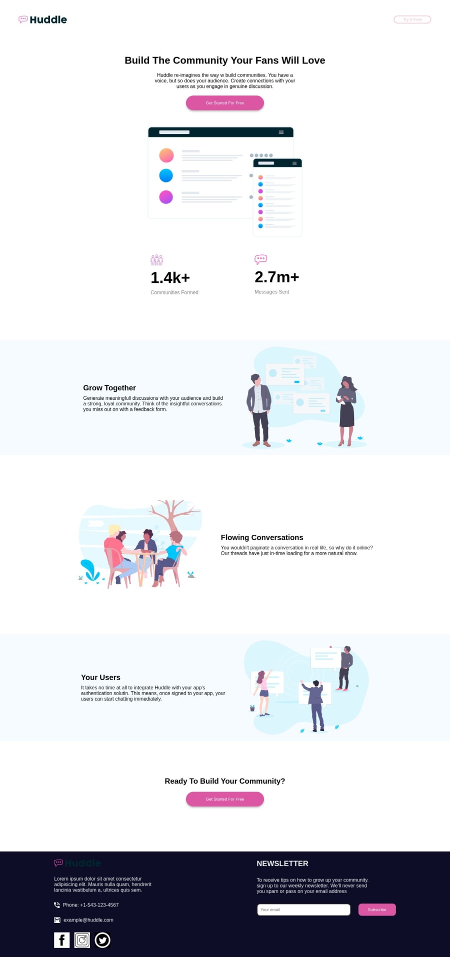
Design comparison
SolutionDesign
Solution retrospective
All feedback is welcome
Community feedback
- @Mennatallah-HishamPosted about 1 year ago
Hi @leodk293 ,
you did great in this challenge
here are some suggestions to improve your code:- wrap your main content with a <main>
<header/> <main/> <footer/>- replace <div> with <section> /<article> to give more semantic meaning
- make sure all your <img> have alt attribute
- having an empty ref href="" is valid but it has some downsides, it is better to use href="#" instead
- for the social links contact you can improve accessibility by
<li> <a href="#" **aria-label="visit our Facebook page"**> <img src="https://encrypted-tbn0.gstatic.com/images? q=tbn:ANd9GcTQXho8CCBA0q4L2t0itp6PvjP8A2SQSpBgcIW4N5U&s" **aria-hidden="true"** > </a></li>- adding aria-hidden="true" will make screen readers ignore/ skip the image
- add meta description for better SEO
here are some articles
- Meta description: https://moz.com/learn/seo/meta-description
- Semantic Html: https://web.dev/learn/html/semantic-html/
hope you find this helpful. Happy Coding
0
Please log in to post a comment
Log in with GitHubJoin our Discord community
Join thousands of Frontend Mentor community members taking the challenges, sharing resources, helping each other, and chatting about all things front-end!
Join our Discord
