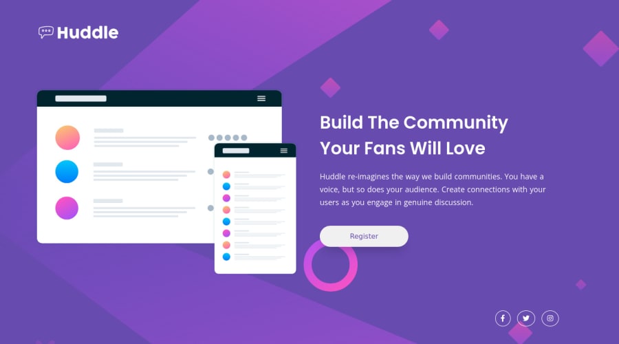
Huddle-landing-page responsive using CSS, Flexbox
Design comparison
Solution retrospective
Any feedback or thoughts about my code? Thanks!
Community feedback
- @FluffyKasPosted over 3 years ago
Hi, your solution looks good! Responsiveness seems fine too. I only have some feedback on your HTML:
-
Instead of using so many divs, I think your content could be separated into 2 bits: a
header(containing the logo) and amain(for the rest). Usingfooterfor the attribution works well though. -
Social icons: giving them hover states isn't enough, unfortunately ^^ The best approach would be probably this: instead of a div, you could use a <ul>, and inside each <li> use a link <a>, as these are supposed to be links pointing to social media websites :) In this case, don't forget to add some aria-labels, as they don't have any text description.
-
You have one heading in the whole page and it should be an <h1>. When considering using headings, always go from <h1> and work your way down from there, one by one. This is the good semantic approach, styles can be applied with css later on.
+1: Your button could use a
cursor: pointer^^Marked as helpful0@markfalcutilaPosted over 3 years ago@FluffyKas Thank you! appreciate it, I will try to use it in my next activtiy challenge. Godbless man !
0 -
Please log in to post a comment
Log in with GitHubJoin our Discord community
Join thousands of Frontend Mentor community members taking the challenges, sharing resources, helping each other, and chatting about all things front-end!
Join our Discord
