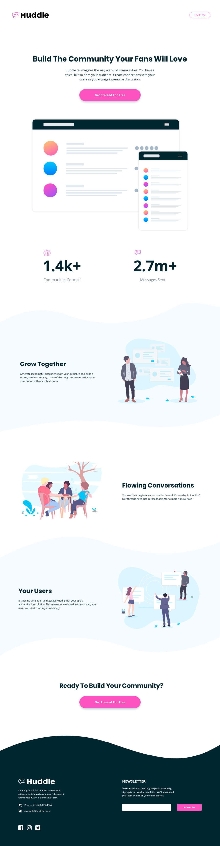
Not Found
Not Found
Not Found
Not Found
Not Found
Not Found
Not Found
Not Found
Not Found
Not Found
Not Found
Not Found
Not Found
Not Found
Not Found
Not Found
Not Found
Not Found
Not Found
Not Found

Submitted

Huddle-landing-page

Desktop design screenshot for the Huddle landing page with curved sections coding challenge

This is a solution for...

  • HTML
  • CSS
2junior
View challenge

Design comparison


SolutionDesign

Solution retrospective


It was a very large page so it was good practice, I had to think about how to place each element, however I feel the code could be improved because I didn't optimize it. By the way, I need a tip for the icons and how to change the icon color with CSS. I will listen to any suggestions.

Fue una pagina muy grande por lo que fue una buena practica, tuve que pensar como colocar cada elemento, sin embargo siento que el código puede mejorarse debido a que no lo optimize. Por cierto, necesito un consejo para los iconos y para poder cambiar el color del icono con CSS. Cualquier sugerencia sera escuchada.

Community feedback

Carl 855

@CarlHumm

Posted

To change your logo's colour you can use an inline svg instead of an img element and style that SVG using either CSS or inline with the fill attribute.

Here is a basic example of what I mean. In this example, I-

  1. Opened up logo.svg in new tab
  2. Inspected SVG code for logo.svg
  3. Replaced img element with copied code
  4. Removed fill: none attribute, and removed inline fill values on path elements.
  5. Added fill property for entire SVG using CSS selector (Could use class or id if you wanted)

Here are some useful resources on using SVG.

  1. CSSTricks
  2. MDN

Other areas for improvement could include:

  1. Adjusting background-position and size for divider elements.
  2. Centering page content and adding margins using a container or grid.
  3. Avoiding distorting images by sizing with width
  4. As the structure for grow-container, flowing-container and user-container is the same, you should group the shared styles into their own class, and add stylistic differences using a new class, id, or other identifier.
  5. Add main element for accessibility. I see you've done well to use other elements like header, nav, section and footer.
  6. Correct responsiveness on mobile. You could add a media query to adjust flex-direction to column, and remove the large margin on your paragraph as it's squishing the text too much.

Other than these points, very good job. It is a large landing page with lots to consider. Good luck on your next project!

Marked as helpful

0

Please log in to post a comment

Log in with GitHub
Discord logo

Join our Discord community

Join thousands of Frontend Mentor community members taking the challenges, sharing resources, helping each other, and chatting about all things front-end!

Join our Discord