Not Found
Not Found
Not Found
Not Found
Not Found
Not Found
Not Found
Not Found
Not Found
Not Found
Not Found
Not Found
Not Found
Not Found
Not Found
Not Found
Not Found
Not Found
Not Found
Not Found

Submitted

huddle_landing_page

@Durgathev


Design comparison


SolutionDesign

Solution retrospective


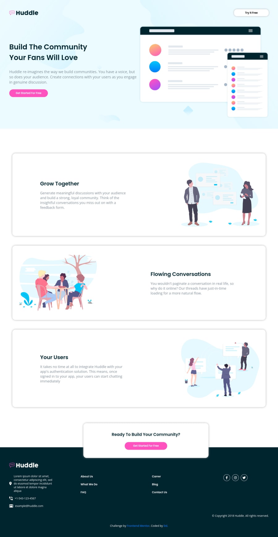
Hello Everyone, this is my another challenge. could someone help me with media queries for mobile view?

Community feedback

Adrianoβ€’ 34,090

@AdrianoEscarabote

Posted

Hi DurgaDevi, how are you?

You did a great job on this challenge, but I have a few tips I think you'll like:

I noticed that you got some good tips on media query, so I'll talk about how the layout is adapting to higher resolutions.

There are some divs that have a height of 100vh this is causing the page to have a lot of space between elements. For example:

main .footer-section { /* height: 100vh; */ }

main .home { /* height: 100vh; */ }

I noticed that the layout is growing a lot and leaving the elements very stretched, to fix this we can do the following:

First we will create a div that will receive the content, and in it we will put a max-width: 1440px; and a margin: 0 auto;. In this div that will receive the content we will create a parent div for it that will receive the background images.

For example:

<div class="background-image"><div class="content"><h1>HI</h1></div></div>

The rest is great! Hope it helps... πŸ‘

Marked as helpful

0

@Durgathev

Posted

Hi @AdrianoEscarabote, I'm doing good. Hope you're doing well.

Thanks for your comments. I'm stuck on that height property in CSS. Because every time it takes extra space and I don't know how to solve it. Thanks for noticing the issue and providing a solution. I will implement this and share the result soon.

Glad to hear you again πŸ™.

1
Adrianoβ€’ 34,090

@AdrianoEscarabote

Posted

@Durgathev no problem, glad to help! 😊

1
Md5 daltonβ€’ 1,430

@md5dalton

Posted

Hello DurgaDevi Shanmugam πŸ‘‹

If you want your app to be responsive, I'd suggest you go with mobile first approach and this means creating a layout where the default design is for narrow screen or mobile devices, then change the layout with CSS media queries when the screen increases in size.

To address your question, we will not be creating media queries for mobile since in mobile first approach, we assume that all your default styles are targeted to mobile screen sizes, then we are going to create media queries to define styles for bigger screen devices. Below are some examples I've used and please note that you don't have to define styles in each and every one of those media queries.

/* Small tablets and large smartphones (landscape view) */
@media (min-width: 576px) {...}

/* Small tablets (portrait view) */
@media (min-width: 768px) {...}

/* Large tablets and desktops */
@media (min-width: 1200px) {...}

Hopefully that gives you an idea on how you can implement your own. You can always change the width values to your liking, there's no need to use exactly those ones. πŸ‘Œ

Marked as helpful

0

@Durgathev

Posted

Hi @md5dalton , thanks for sharing the valuable note. It gonna help me a lot. thanks again.πŸ‘

1
Lucas πŸ‘Ύβ€’ 104,420

@correlucas

Posted

πŸ‘ΎHello DurgaDevi, Congratulations on completing this challenge!

Nice solution and nice code! I can see that you paid a lot of attention to your code/design. If you don’t mind I’ve some tips for you:

To make the mobile version you'll have to change the grid layout to a single column with grid-template-columns: 1fr;. Then you'll have to fix all the other sections and apply this media query for all the sections.

One example:

main .home .container {
    display: grid;
    grid-template-columns: 1fr;
    grid-auto-rows: 400px;
    grid-gap: 40px;
    padding: 30px 40px;
}

If you’re not familiar to media queries and responsiveness, here’s a good resource to learn it: https://www.w3schools.com/css/css_rwd_mediaqueries.asp

The images are not with the correct proportion and are distorted. To have all the image inside the container scaling and respecting the size of the container, you need to add max-width: 100% and add alsoobject-fit: cover to make the image auto-crop when resizing inside the column:

img {
    display: block;
    object-fit: cover;
    max-width: 100%;
}

✌️ I hope this helps you and happy coding!

Marked as helpful

0

@Durgathev

Posted

Hi @correlucas ,

Thank you, I really appreciate you taking the time to explain this. It's really helpful.. I'll try it out .😊

1

Please log in to post a comment

Log in with GitHub
Discord logo

Join our Discord community

Join thousands of Frontend Mentor community members taking the challenges, sharing resources, helping each other, and chatting about all things front-end!

Join our Discord