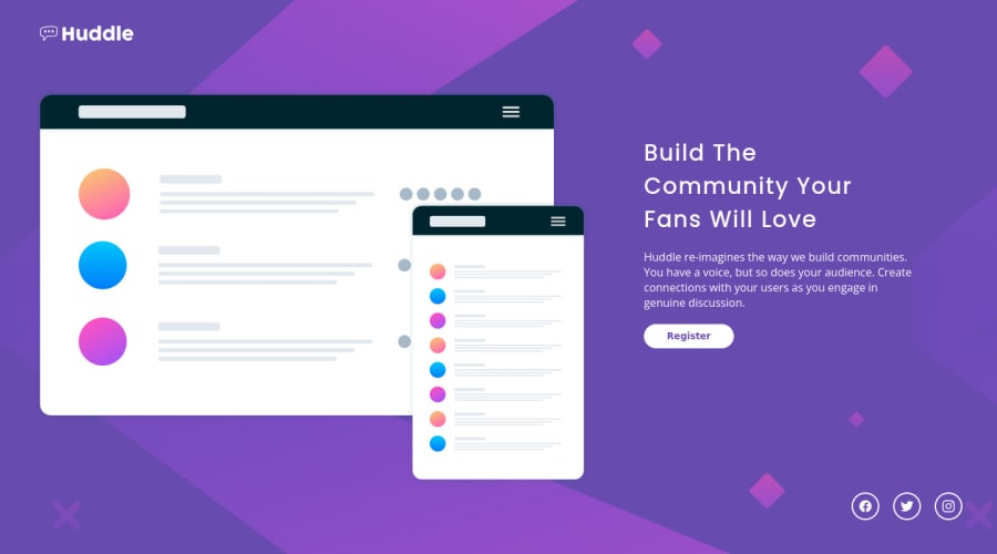
Design comparison
SolutionDesign
Solution retrospective
Let me know what u think about code, and if that's the corect way to achive this solution! :)
Thanks in advance!
Community feedback
- @muhammadshajjarPosted about 3 years ago
Hello, congrats on completing your FEM challenge, yep you approach the design as needed but at some viewports, your content is overflowing and some other suggestions that would help you with your design and solution
- Background-image is repeating, use
background-repeat:no-repeat; - Add
max-widthto a body or make a container class that wraps your all content, by adding it you can control your content from growing too much on larger viewports and save yourself from this situation - The logo should be in anchor
a, logos are used to navigate on the home page in most the cases - Your images should have
altattribute but for decorative images, you should leavealtas blankalt=""and userole=" presentation"oraria-hidden=" true"to make sure all screen readers ignore those images. In your case, the illustration image is decorative. - To overcome your accessibility issue you would need to add some semantic markers to designate sections of the page as the header, navigation, main content, and footer e.g:
<main>
<div class”wrapper”>
</div>
</main>
Apart form this very well done, keep up the great work
Marked as helpful1 - Background-image is repeating, use
Please log in to post a comment
Log in with GitHubJoin our Discord community
Join thousands of Frontend Mentor community members taking the challenges, sharing resources, helping each other, and chatting about all things front-end!
Join our Discord
