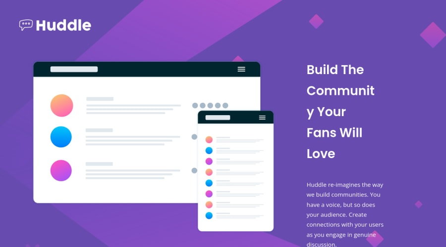
Design comparison
SolutionDesign
Solution retrospective
Hello !
I found not easy to work with icon at the beginning. But thanks to this challenge, I learned new skills ! I know my code is still far from perfect but each challenge allows me to improve and discover new ways to create. Fell free to comment ;)
Community feedback
Please log in to post a comment
Log in with GitHubJoin our Discord community
Join thousands of Frontend Mentor community members taking the challenges, sharing resources, helping each other, and chatting about all things front-end!
Join our Discord
