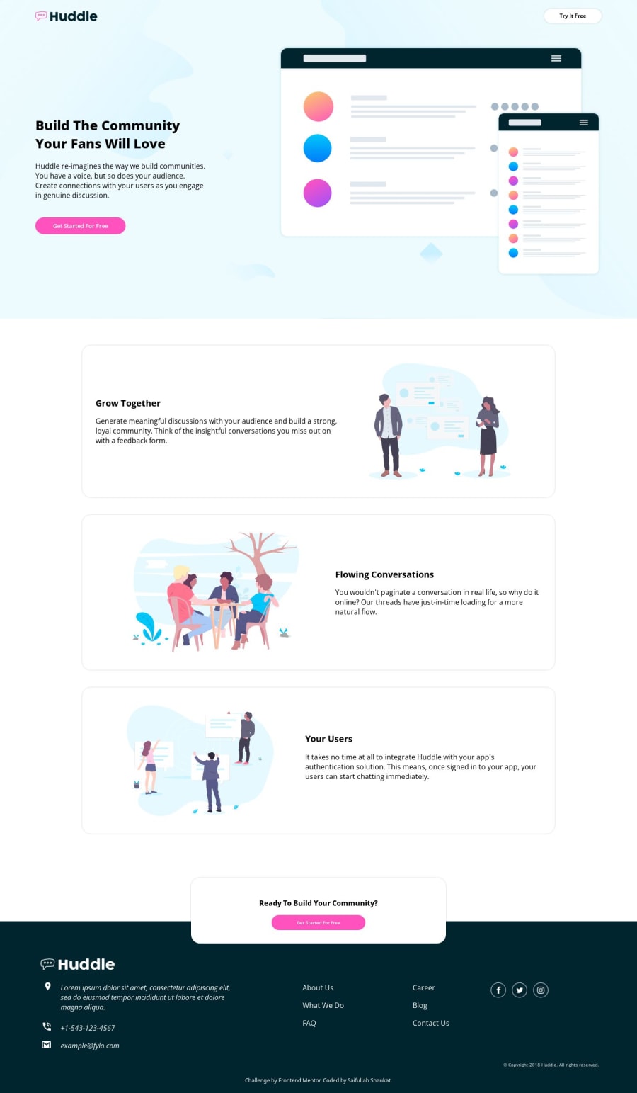
Huddle Web Page - Using Semantic HTML & Flexboxes
Design comparison
Solution retrospective
I'm most proud of successfully tackling the challenge of designing and coding a responsive landing page for Huddle. It was fulfilling to see the project come together, from conceptualization to implementation. However, looking back, I realize the importance of better organizing my CSS to improve maintainability and scalability. Next time, I would adopt a more structured approach to CSS, perhaps using methodologies like BEM or CSS-in-JS, to streamline development and make future updates easier.
What challenges did you encounter, and how did you overcome them?Throughout the project, I encountered several challenges, including:
-
Responsive Design Complexity: Ensuring the website looked great on all devices was challenging. I tackled this by using media queries and flexible layouts to adapt to different screen sizes.
-
CSS Organization: With a growing CSS file, maintaining organization became difficult. To overcome this, I modularized styles into separate files and used naming conventions for clarity.
-
Image Optimization: Large image files slowed down page loading times. I optimized images using compression techniques and implemented lazy loading to improve performance.
-
Browser Compatibility: Ensuring consistency across different browsers posed a challenge. I used browser developer tools for testing and applied vendor prefixes for CSS properties to ensure compatibility.
-
Code Refactoring: As the project evolved, some code became redundant or inefficient. I regularly reviewed and refactored code to improve readability and performance.
By staying proactive, seeking guidance from online resources, and persistently troubleshooting issues, I successfully overcame these challenges and delivered a high-quality website.
What specific areas of your project would you like help with?I would appreciate assistance in the following areas of my project:
-
Accessibility: Ensuring the website is accessible to users with disabilities by implementing proper ARIA attributes and keyboard navigation.
-
Optimization: Further optimizing the website for performance by identifying and resolving any bottlenecks in loading times or rendering.
-
Cross-Browser Testing: Conducting thorough testing across various browsers and devices to ensure consistent functionality and appearance.
-
Code Review: Receiving constructive feedback on my codebase to improve its structure, readability, and adherence to best practices.
-
UI/UX Design: Enhancing the user experience and interface design to make the website more intuitive and visually appealing.
Any insights, suggestions, or contributions in these areas would be greatly valued to elevate the quality of the project.
Community feedback
Please log in to post a comment
Log in with GitHubJoin our Discord community
Join thousands of Frontend Mentor community members taking the challenges, sharing resources, helping each other, and chatting about all things front-end!
Join our Discord
