Design comparison
Solution retrospective
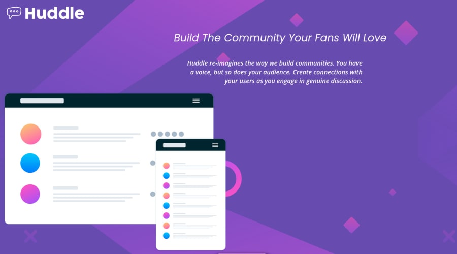
Hi, As you can see by my choice of challenge that I'm a newbie at CSS. This challenge is still incomplete. I cannot make it mobile friendly. Don't know how to make it responsive. Don't know why their are 2 primary colors in the style.md file of this challenge, if i'm supposed to use both of them then how? Don't know how to decorate text as given in the jpg. More help will be much appreciated.
Community feedback
- @grace-snowPosted over 3 years ago
Hello
My first tips are to pause and address the html before doing anything.
- Html semantics. The button element should be an anchor tag, as it would trigger navigation. The alt text on a logo image needs to say what the image is, in this case the name of the product
- Plan your layout and add structure needed to your html. Use divs for now. Think about mobile first where all is stacked, then desktop where it is not. How should content be grouped or separated to acheive that layout? Looking at the design I think you need:
- header with logo image inside. Maybe wrap the logo image in an anchor tag, as it's usual for a logo to click to go to homepage
- a div with two more divs inside - one to wrap the illustration img and one to contain the written content
- a div or footer with the 3 social logos in. They would be clickable, so should also be wrapped in anchor tags that have aria-label attributes on them with the name of. The social network.
Once that's done you are in a much better place to start styling.
Marked as helpful1@grace-snowPosted over 3 years agoStyling time... ☺
Initial tips
- Remove all floats
- remove all keywords for font sizes (like font-size large). Use rem instead for better control, and never ever use pixels for font size
- don't style with IDs. Use classes instead.
- at the very top of your css file, add a basic css reset to remove default browser styles. Best to do this in every project. I like this one by Andy Bell
With your question about colors I can see both in the design images. One is the button text color and the other used for the active/hover states on anchor tags.
Now have a go at styling without using any floats.
Start with mobile. Open dev tools on the side and shrink your browser down to mobile size. That's the best place to start from as all content is stacked. Get the font sizes and styles right, image size, padding, vertical margin etc. Use max-width in px or rem, and center everything with text-align center and margin auto on the left and right. Add hover, active and focus-visible states to the interactive elements. _remember, focus visible is for keyboard users so they know where they are on the screen - no designs are provided for that but usually a bold obvious outline is a good way to do it).
Once you are happy with how mobile looks, start to enlarge the browser. Add max-width to containers if they are going too wide.
When it looks like there is room for the layout to change to desktop, stop enlarging the screen. Hover over or select the html/body element in devtools to see how wide the screen is. This is roughly where you want your min-width media query to start. Eg
@media (min-width: 850px) { // desktop overrides go in here}
Inside that media query override only the styles that need to change for desktop. That will mainly be
- text-align
- margin auto may go to one side only on some elements
- making the wrapper div around illustration and content into display flex and making those inner divs flex-basis 50%.
This should all help you a lot. Main idea is to be methodical and approach it all step by step
1@skyrunner360Posted over 3 years ago@grace-snow Hey! thanks for such constructive comment. I really appreciate it. Plus, I'm in love with this helpful community.
0 - @BrezusPosted over 3 years ago
Hi Rishi a fellow newbie here i can answer some of your questions in the order you asked so.. 1 to make it mobile friendly you will have to learn about media queries also learn about max-width min-width and clamp those can all help in making designs for mobile 2 if you want responsive you have to use relative units like ems, rems, vh, vw or percents instead of pixels as pixels don't adjust on browser resize 3 do both colors have the same name if so you can change the name of either and use it wherever in the design you want also look up using ":root" it will help with the colors 4 the text styles are provided for us follow the url's or better yet watch a few tutorials on youtube to figure it out its a bit hard for me to explain since i too am also a beginner i hope this helps and happy coding partner!
Marked as helpful1@skyrunner360Posted over 3 years ago@Brezus Hey! thanks for such constructive comment. I really appreciate it. Plus, I'm in love with this helpful community.
0 - @ArigatouzPosted over 3 years ago
really nice keep ongoing just as a hint the position of the title is not correct according to the original design also the huddle logo and u need to do some margin of the image other than that well done :D
Marked as helpful1@skyrunner360Posted over 3 years ago@Arigatouz Hey! thanks for such constructive comment. I really appreciate it. Plus, I'm in love with this helpful community.
0
Please log in to post a comment
Log in with GitHubJoin our Discord community
Join thousands of Frontend Mentor community members taking the challenges, sharing resources, helping each other, and chatting about all things front-end!
Join our Discord