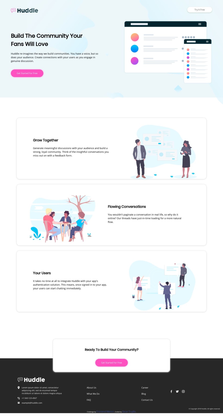
Design comparison
Solution retrospective
This is my first Challenge. I have just learned HTML and CSS basics.
Community feedback
- @shubhamthedevPosted over 4 years ago
Hi Oscar, your design looks awesome being this is your first challenge this is mighty impressive, the fact that you have no accessibility and HTML validation issues it's great.
Some suggestion i would give would be:
-In the header section the <a> tags should have a heavier weight font.
-The box that you've labelled a,b,c extra have shadows in the x-direction which isn't the case with the actual design and probably is a mistake in the CSS.
.box-a {
  box-shadow: 0 1px 9px 1px #dbdbdb;
}
[Only 4 values are allowed in here you could learn more at:]
(https://www.w3schools.com/CSSref/css3_pr_box-shadow.asp)
-
The header image is overflowing.
-
The site is not responsive although being this is your first design, you could overlook that.
Keep working hard and Happy Coding 👨💻
1@OscarTruPosted over 4 years ago@tomboynotes thank you very much. I spent a few hours researching about CSS selector and that. I will keep improving it till it is responsive I will definitely keep coding.
0 -
- @adarshcodesPosted over 4 years ago
Hey! @Oscar Trujillo, firstly congratulations on completing your first Challenge and Welcome to this amazing community of the learning developer.
Let's take a look at your solution from a few aspects:
- Design aspect
- Your design looks great👍. But there are a few changes you can make: Remove the image
width: 100%, and it will fix the image overflowing. - The footer color is different from the design given, you can change it.
- Responsiveness aspect
- There's a problem of overflowing and overlapping in your responsive design try to fix it, as it also suggested by @whimsicurl-creations, you can take a look at the resources while has been told by her too.
- Code aspect
- Your code looks clean.
- Issues aspect
- Great! It's your first solution and no Issues aroused👍
Keep Coding🐱💻
1@OscarTruPosted over 4 years ago@adarshcodes thank you very much. I will try to fix the overflowing and overlapping. Your feedback is too valuable to me. I will definitely keep coding.
0 - @whimsicurl-creationsPosted over 4 years ago
Welcome to the Frontend Mentor community, Oscar! Your design looks pretty good at the desktop size. The illustrations do overflow the containers a bit. You don't have any accessibility or HTML issues, so that's a wonderful start.
Scaling your design down to a smaller screen size does cause overlap. I'd recommend checking out resources on flexbox and/or CSS grid to allow you to set up a layout that you can modify for different screen sizes. Since both methods also work with container elements, you can set your boxes as the containers which will also help keep the entire illustration inside the box. There are TONS of great links on the Resources page here on Frontend Mentor - check out some on flexbox or CSS grid and give them a try to continue your learning!
1@OscarTruPosted over 4 years ago@whimsicurl-creations thank you very much for your feedback. It is really useful to me that I am a very beginner.
0
Please log in to post a comment
Log in with GitHubJoin our Discord community
Join thousands of Frontend Mentor community members taking the challenges, sharing resources, helping each other, and chatting about all things front-end!
Join our Discord
