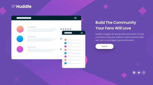
Submitted about 2 years agoA solution to the Huddle landing page with a single introductory section challenge
Huddle Single Landing Page
@yozidst

Solution retrospective
This was quite an unexpected challenge for me. In order to shift the contents in the mobile layout, I had to rely on an unconventional process. If anyone has any tips to improve such case, feel free to leave a comment/ critique.
Any feedback is welcomed!
Code
Loading...
Please log in to post a comment
Log in with GitHubCommunity feedback
No feedback yet. Be the first to give feedback on Yonten's solution.
Join our Discord community
Join thousands of Frontend Mentor community members taking the challenges, sharing resources, helping each other, and chatting about all things front-end!
Join our Discord