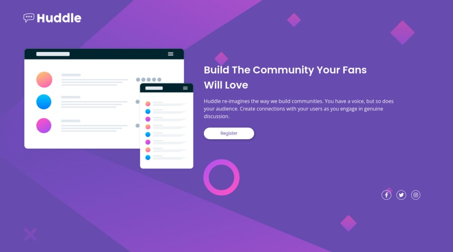
Design comparison
Solution retrospective
Hi! I have accessibility issues with this solution when using links and icons since there is no text to tell the purpose of the link and the <i> doesn't accept alt text like an <img>... does anybody else faced this problem? Thank you :)
Community feedback
- @vanzasetiaPosted over 2 years ago
Hello there! 👋
Congratulations on finishing this challenge! 👏
Regarding the accessibility issues, you can add
aria-labelattribute to each anchor tag to give some text about the link. For example, if it is a Facebook icon then the value for thearia-labelwould bearia-label="Facebook".I have one question, each issue has the "Learn More" link. So, have you visited the site? Right there, you can get more information about the issue and how to solve the issue. 😉
I have a few suggestions for this solution.
- I would recommend making the visible
h2as theh1and then removing the visually hiddenh1. I think the currenth2can be a greath1. Also, I assume that it is the first part of the landing page. - I would not recommend hiding the attribution. The users who don't use screenreaders would have no idea that there are links to the Frontend Mentor challenge page and your profile.
I hope this helps! Happy coding! 😁
Marked as helpful0@Ax-cdPosted over 2 years ago@vanzasetia Hello! Thank you!
I actually visited the site! I truly don't know how I could miss the information; but thank you for redirecting me to it!
I took into consideration your suggestions when I updated my solution, so thank you again for the feedback! :D
0@vanzasetiaPosted over 2 years ago@Ax-cd I took a look at the updated source code and everything looked great to me! Good job on improving the solution! 👍
Keep it up! 😉
0 - I would recommend making the visible
Please log in to post a comment
Log in with GitHubJoin our Discord community
Join thousands of Frontend Mentor community members taking the challenges, sharing resources, helping each other, and chatting about all things front-end!
Join our Discord

