Submitted 6 months ago
Huddle Project using Mobile-first workflow

P
@cookie-monster01

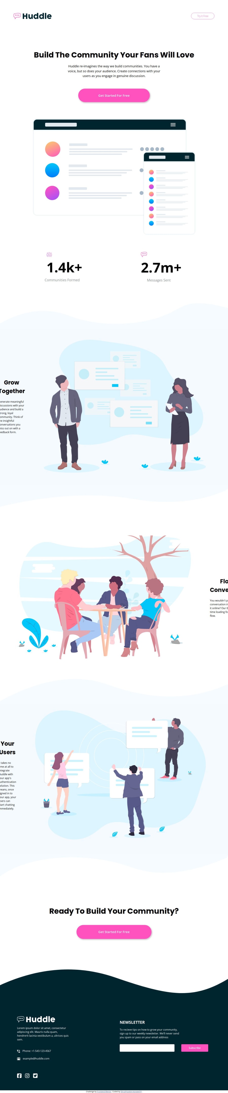
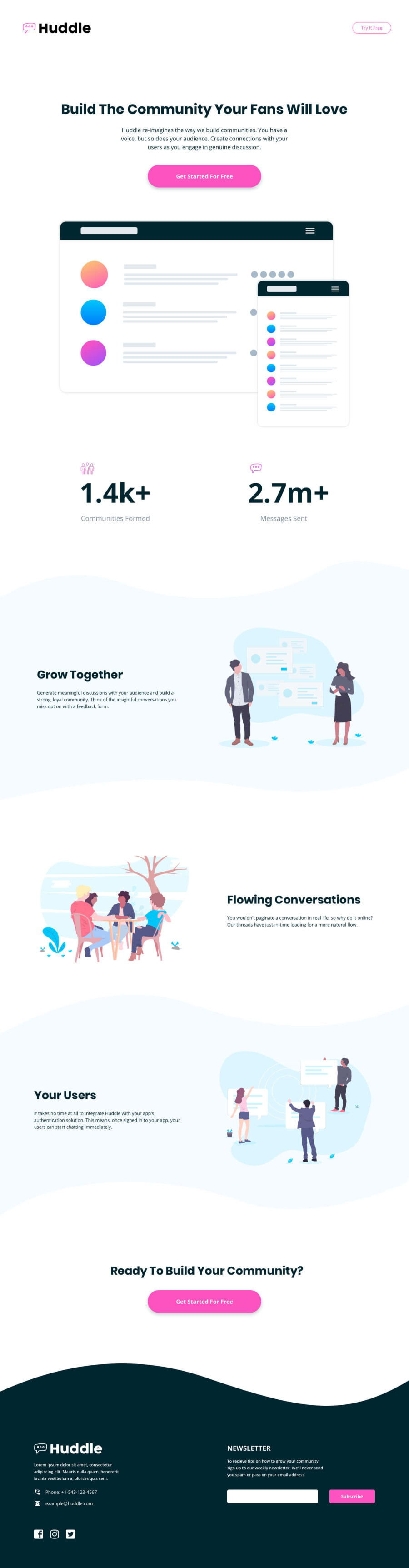
Design comparison
SolutionDesign
Solution retrospective
What are you most proud of, and what would you do differently next time?
- I learnt about responsive font-sizes using clamp().
- I have also used, min(), max() and calc() on padding, margins and width.
- I think I have understood when to use em, rem, px and % - please correct me if I'm wrong.
#What would I do differently?
In my next project, I will use Bootstrap.
What challenges did you encounter, and how did you overcome them?- I started working on the project with Desktop screen size and soon realized I should try using Mobile-first workflow, after reading about Bootstrap.
- I learnt about responsive sizing of font, images, padding and margin.
- I used column gap to separate elements, but because the footer elements were not responsive, I realized that gap property does not shrink the gap between elements as we resize the webpage.
- I don't think I have understood correctly the use of min() and max() for responsive design, and whats the best practice.
- At 1200px, footer element .subscribe, shifts to the right edge. I do not understand how I could center the elements, I tried using margin: 0 auto to center the footer elements but did not work.
- My webpage had a horizontal scroll, and I couldn't understand what was causing the overflow. Although, I don't have that scroll on the live url, also, don't know why.
Community feedback
Please log in to post a comment
Log in with GitHub
Join our Discord community
Join thousands of Frontend Mentor community members taking the challenges, sharing resources, helping each other, and chatting about all things front-end!
Join our Discord