Design comparison
Solution retrospective
Suggest me areas to improve on
Community feedback
- @Bayoumi-devPosted over 2 years ago
Hey Etinhandy, Congratulations on completing this challenge... Here are some suggestions:
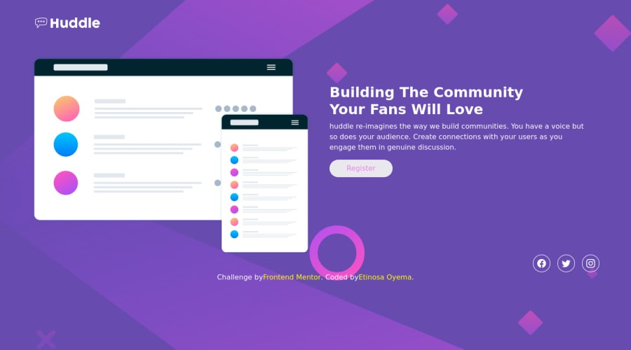
Document should have one main landmark, Contain the component with<main>.
<main id="page-holder> <div class="container"> //... </div> </main>-
Page should contain a level-one heading, Changeh2toh1You should always have oneh1per page of the document...<h1>should represent the main heading for the whole page, and for the best practice use only one<h1>per page. -
I suggest you put
the socialsinto thelist itemto add moresemanticsto your project...
 <ul class="socials">
   <li class="icons"><a href="https://www.facebook.com/"><img src="./images/facebook.svg" alt="facebook"></a></li>
   <li class="icons"><a href="https://www.twitter.com/"><img src="./images/twitter.svg" alt="twitter"></a></li>
   <li class="icons"><a href="https://www.instagram.com/"><img src="./images/instagram.svg" alt="instagram"></a></li>
 </ul>
Hope this help!... Keep coding👍
Marked as helpful0 - @EtinhandyPosted over 2 years ago
After going through your suggestions, I now realise how important the main tag is for screen readers.
Also, thank you for your tip on the socials. Thank you very much.
0
Please log in to post a comment
Log in with GitHubJoin our Discord community
Join thousands of Frontend Mentor community members taking the challenges, sharing resources, helping each other, and chatting about all things front-end!
Join our Discord
