Submitted over 3 years ago
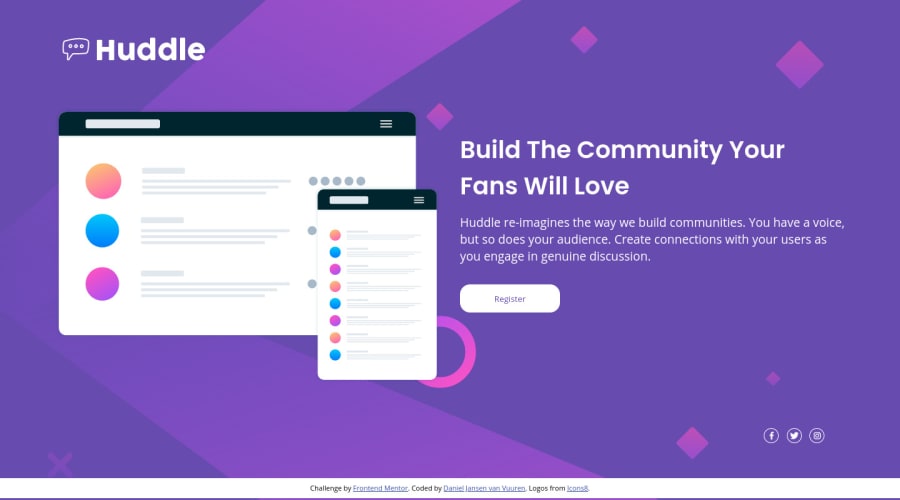
Huddle Mobile and Desktop Responsive Landing Page

@DanielJvV

Design comparison
SolutionDesign

Solution retrospective
Made this web page for 375px and 1440px screen sizes. Just wanted to know if my code is acceptable out there in the real world haha. What I could improve to make it something that a paying customer would be happy with. Any advice basically. Thank you in advance.
Please log in to post a comment
Log in with GitHubCommunity feedback
- @sweenejp
Looks good to me. One thing I noticed is that the social media icons don't change color on hover.
You could also try keeping the text within column 2 from condensing when you resize the window.
Marked as helpful

Join our Discord community
Join thousands of Frontend Mentor community members taking the challenges, sharing resources, helping each other, and chatting about all things front-end!
Join our Discord