Huddle LP w/ Alternating Feature Blocks (Vanilla CSS + Custom Logo)
Design comparison
Solution retrospective
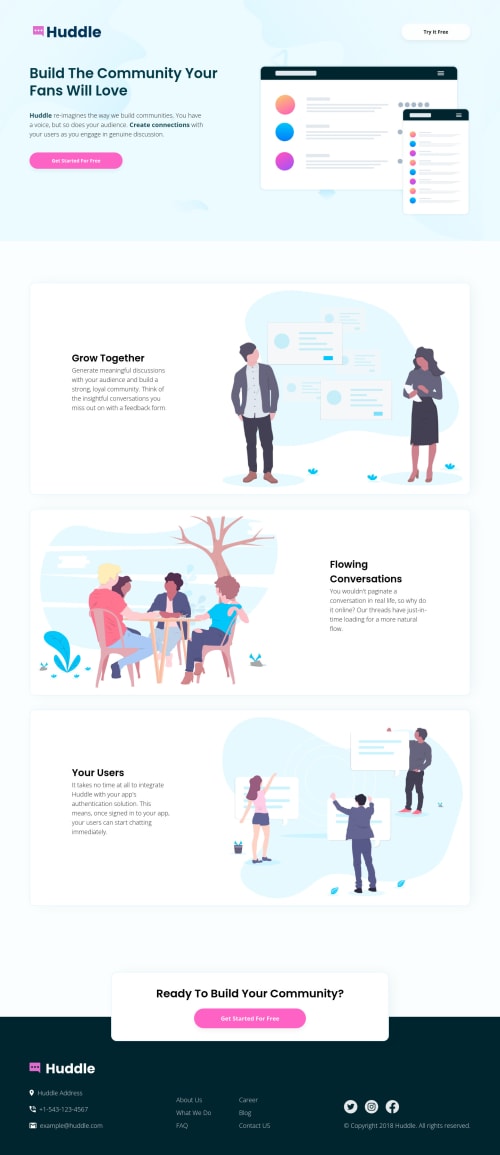
👾 Hello, Frontend Mentor coding community. This is my solution for the Huddle Landing Page With Alternating Sections.
I added some features:
- 😎 I recreated the logo as a SVG (this way I could animate it).
- 👻 I added an animation on the logo (chat-box icon flip and turn).
- 👨🔬 Some custom design improvements.
Happy to hear any feedback and advice!
Community feedback
- @elaineleungPosted about 2 years ago
Great work Lucas, as always! Really cool logo, and I remember seeing it on the other Huddle landing page you did (I think it was there) but I only noticed the changing color with this logo, which is really nice and clever. Anyway, I really only have one quick comment here based on what I noted when looking through the site: for the sections with a border around the section when hovered over, I probably would just keep things as they normally are, as in, I don't think I'd add a hover style with the section, as having a color change for the border would most likely suggest interactivity, which isn't the case in the sections. Well done once again!
Marked as helpful3@correlucasPosted about 2 years ago@elaineleung Hello its true! I'll change it. I've to take easy with these hover effects and think more about the UX.
2 - @rodrigompiresPosted about 2 years ago
Hello Lucas. I tested the responsiveness of the page, and verified that between 490px and 421px the Try it Free button is deforming it and overlapping the logo a little. Another point I noticed is that even at this screen size, the first Get Started For Free button is aligned to the left and the other elements (except the footer) are aligned to the middle. I hope it helps. Hugs.
Marked as helpful2 - @Senkuu-MidoriyaPosted about 2 years ago
Hey Lucas, amazing website that you have built, I especially liked your logo affect. It is amazing how your are able to make the websites designs even better. If you don't mind, how did you get the svg to animate, and how did you format your code to be able to do that. I am a newbie and don't have much experience yet, and seeing you do such amazing things is jaw dropping to me. Any answer would be appreciated from a knowledgeable person like you.
If you don't mind me saying, I noticed that the middle section of your webpage moves a bit when it is hovered over, I am not sure if this was intentional but it is a very slight thing.
Thanks for sharing you knowledge with us, aDev
Marked as helpful0@correlucasPosted about 2 years ago@Senkuu-Midoriya Hey my friend! Thanks for the kind words! To animate the SVG you'll do it normally as you do it every element using
hover
. First step its to separate the elements in two blocks different to get animated separately (the icon + name).Then to work the svg properties like
fill
you need to convert the svg into path. Here's two resources I've used for it:https://stackoverflow.com/questions/11529470/is-there-a-tool-to-create-svg-paths-from-an-svg-file
https://codepen.io/thednp/pen/EgVqLw
https://yoksel.github.io/relative-clip-path/
I hope this helps you bro! Keep it up =)
1@Senkuu-MidoriyaPosted about 2 years agoThank you so much @correlucas for providing not only an explanation but also a few helpful resources to use. It is so rare that someone so good and web dev like you are, is still sharing resources that they used to make something, and taking the time to explain it. These are very valuable to me and I will make sure to use them in my next project.
Thanks you for sharing you knowledge with us and I hope to continue to see you make amazing webpages, aDev
0 - @alexanderbonneyPosted about 2 years ago
The website looks great. Loving the modifications you added.
2
Please log in to post a comment
Log in with GitHubJoin our Discord community
Join thousands of Frontend Mentor community members taking the challenges, sharing resources, helping each other, and chatting about all things front-end!
Join our Discord