Huddle LandingPage with Single Intro Section | Flexbox | Media Queries
Design comparison
Solution retrospective
Hi All,
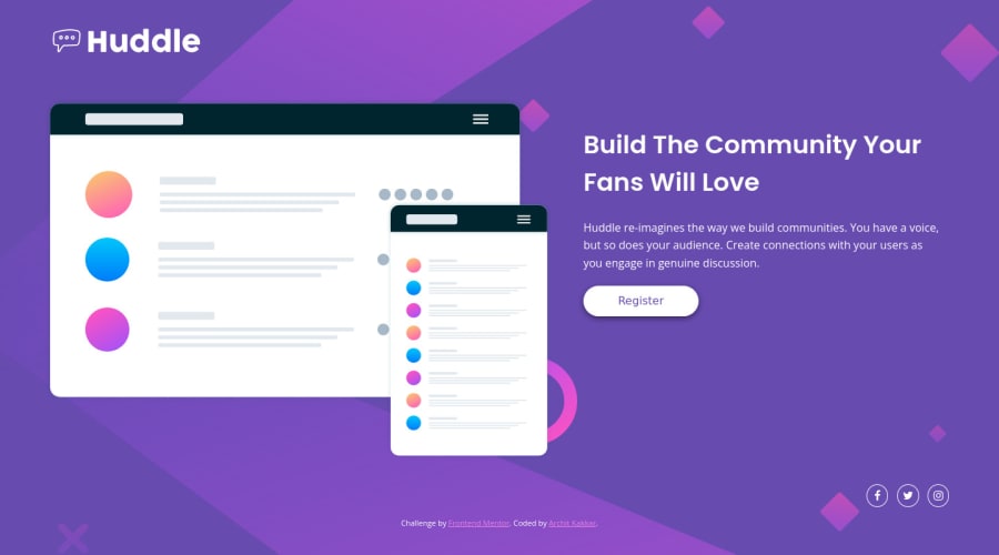
Made this simple landing page with a single introductory section using pure CSS. I have used flexbox and media queries to make it responsive. Let me know how you find it! Your feedback will be much appreciated.
Cheers, Archit :)
Community feedback
- @vanzasetiaPosted over 2 years ago
Greetings, Archit Kakkar! 👋
Nice work on this challenge! 👍
I have a few suggestions for this solution.
- The logo's alternative text should be the company's name. Also, alternative text should not have the word is related to "image". The semantic meaning of the
imgelement is enough to tell the screenreaders that it is an image. - Wrap each social media icon with an anchor tag. Also, add
aria-labelto give text content to the anchor tag so the link element is accessible by screenreader users. - I highly recommend writing the styling using the mobile-first approach. It often leads to shorter and better performance code. Also, mobile users won't be required to process all of the desktop styles.
I hope this helps! 😁
Marked as helpful0@architkakkarPosted over 2 years agoHi @vanzasetia ,
This was really helpful! Will surely implement your suggestions in my upcoming projects.
Cheers, Archit.
0@vanzasetiaPosted over 2 years ago@architkakkar
Happy to hear that was helpful! 😊
It's best the issues that are available on this project first before moving on to the next project. It's because fixing bugs and/or improving code is one of the skills that you will need as a developer. 😄
0 - The logo's alternative text should be the company's name. Also, alternative text should not have the word is related to "image". The semantic meaning of the
Please log in to post a comment
Log in with GitHubJoin our Discord community
Join thousands of Frontend Mentor community members taking the challenges, sharing resources, helping each other, and chatting about all things front-end!
Join our Discord
