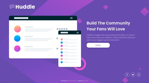
Huddle Landing Page With Single Introductory Section Master
Design comparison
Solution retrospective
Hello world!
This was a little difficult for me, but in the end I did it! :D
I not totally satisfied about some alignment (for example the Huddle logo when illustration and hero section reach their max width)
Hope my solution can be helpful for someone and, of course, all tips are highly appreciated! :D
Have a nice day!
Community feedback
- @correlucasPosted about 2 years ago
👾Hello Francesco, Congratulations on completing this challenge!
Great solution and great start! By what I saw you’re on the right track. I’ve few suggestions to you that you can consider to add to your code:
1.Use a CSS reset to avoid all the problems you can have with the default CSS setup, removing all margins, making the images easier to work, see the article below where you can copy and paste this css code cheatsheet: https://piccalil.li/blog/a-modern-css-reset/
2.A best practice to have all the image inside the container scaling and respecting the size of the container, you need to add
max-width: 100%
and add alsoobject-fit: cover
to make the image auto-crop when resizing inside the column:img { display: block; object-fit: cover; max-width: 100%; }
3.You did a good work putting everything together in this challenge, something you can do to improve the image that needs to change between mobile and desktop is to use
<picture>
instead of<img>
wrapped in a div. You can manage both images inside the<picture>
tag and use the html to code to set when the images should change setting the devicemax-width
depending of the device (phone / computer) Here’s a guide about how to usepicture
:https://www.w3schools.com/tags/tag_picture.asp
✌️ I hope this helps you and happy coding!
Marked as helpful0
Please log in to post a comment
Log in with GitHubJoin our Discord community
Join thousands of Frontend Mentor community members taking the challenges, sharing resources, helping each other, and chatting about all things front-end!
Join our Discord