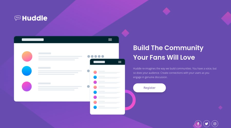
Huddle landing page with single introductory section
Design comparison
Solution retrospective
Hi everyone, this is my solution for the four map features section. Any feedback that can help me improve my skills is welcome.
Community feedback
- @vanzasetiaPosted about 2 years ago
Hi, Virlus! 👋
Congratulations on finishing this challenge! 🎉
Some recommendations from me.
- Put the logo inside the
header
element. - Also, if the landmark has no content, it's better to remove it. Screen reader users can navigate the site through landmark elements. If the landmark has no content then it can be confusing for them.
- The logo is an important image. I recommend learning how to make the SVG accessible. If it is an important or meaningful image or graphic, you can add
role="img"
andtitle
tag as the direct child element ofsvg
.
<svg role="img"> <title>A descriptive title for the SVG element</title> </svg>
- I prefer using
img
tag for the logo. This way, I only need to add alternative text withalt
attribute. It is much simpler than using inline SVG. - For images that are used only as decorations (they do not give users any information and serve only an aesthetic purpose), the alt tag should still exist but should be left empty:
alt=""
. This will tell the screen reader to simply skip over the image. - Alternative text for images should not contain the word "image". The semantic meaning of the
img
element is good enough. - I recommend taking a look at "Quick tip: Using alt text properly - The A11Y Project".
- Avoid using
br
elements for presentational purposes. Read the "Accessibility concerns" part of the MDN documentation forbr
. - Always specify the
type
of thebutton
. - Each of the social media icons should be wrapped by an anchor tag. Those are social media links. Also, use
aria-label
to give each social media link an accessible name. - I recommend adding
rel="noopener"
to any anchor tags that havetarget="_blank"
. It helps protect users of legacy browsers. I suggest reading "Links to cross-origin destinations are unsafe" article to learn more about this.
I have three recommended videos. The first one tells how hard HTML is (HTML is not easy). The other two talk about modern CSS techniques and approaches.
- Manuel Matuzović - Lost in Translation - YouTube
- Andy Bell – Be the browser’s mentor, not its micromanager - YouTube
- Stephanie Eeckles - Scaling CSS Layout Beyond Pixels - YouTube
I hope this helps! Happy coding!
Marked as helpful2@vjeanty02Posted about 2 years ago@vanzasetia Thank you, I will take special time to make changes after I complete all the beginner challenges.
I would like to ask you a question. Do you know why when I use kit Font awesome it causes errors?
0@vanzasetiaPosted about 2 years ago@vjeanty02
It's the code from Font Awesome that causes those errors. You can ignore those errors.
I prefer only downloading the icons that I would use instead of importing the whole Font Awesome library. This way, no errors will appear and the site will load much faster.
Marked as helpful0 - Put the logo inside the
Please log in to post a comment
Log in with GitHubJoin our Discord community
Join thousands of Frontend Mentor community members taking the challenges, sharing resources, helping each other, and chatting about all things front-end!
Join our Discord