Huddle Landing Page With Single Introductory Section
Design comparison
Solution retrospective
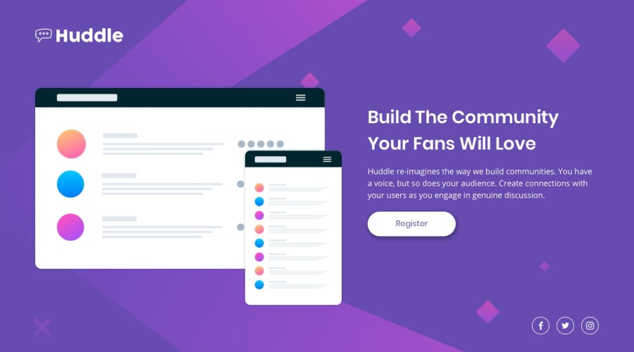
The width of the chat app image was a pain for me and I had to check so many different absolute and relative units and other properties to make it responsively look as it is now, but I still feel it could look much better and with fewer code lines.
So if anyone can give me ideas to help improve the design more, I would really appreciate that.
Feel free to provide feedback. I will be very happy if you tell me how I can improve.
Community feedback
- @BurritoDoggiePosted over 3 years ago
Hello abdo-kotb!
It looks pixel perfect! I love all the extra effects, and it also works great with small devices. Some people don't care about those stuff, but you went on and did it. It can take extra long, but I think that you are a true programer.
Keep Coding!
                        (@@)
                          \__/
Marked as helpful2@abdo-kotbPosted over 3 years ago@BurritoDoggie Thank you very much. 😊
Your comment has motivated me a lot. I really appreciate that. 🙏
2 - @ApplePieGiraffePosted over 3 years ago
Hello there, Abdulrhman Kotb! 👋
Nice job on this challenge! 👏 Your solution looks great and responds well! 😀
The only small suggestion I have is to add
background-size: coverto the CSS background image on thebodyin the desktop layout. That will ensure that the background fills up the entire area of the screen at all times. 😉Hope that helps. 🙂
Keep coding (and happy coding, too)! 😁
Marked as helpful1
Please log in to post a comment
Log in with GitHubJoin our Discord community
Join thousands of Frontend Mentor community members taking the challenges, sharing resources, helping each other, and chatting about all things front-end!
Join our Discord
