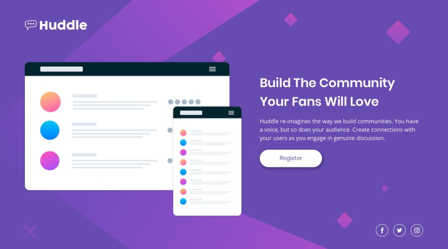
Huddle landing page with single introductory section
Design comparison
Solution retrospective
🚀 Another challenge completed on @FrontendMentor! 💪
I'm steadily working my way through the challenges, starting with the easier ones to build a solid foundation. Excited to continue my learning journey and level up my frontend skills.
If you have any feedback or suggestions for improvement, I'd love to hear them! Let's grow together and create amazing web experiences.
Community feedback
- @grace-snowPosted over 1 year ago
In CSS there's a few really important things to learn too
- NEVER write font size in px
- Next time, work mobile first. This will be shorter and more performant, especially for mobile devices
- Don't use position absolute for the socials. There's really no need. Flex or grid on the parent would do
- Rather than using nested element selectors like
.text aI recommend placing classes directly on what you want to style. Imagine this is a real site - you would want reusable button styles - Generally consider using px less and leaning on other units like em, rem, ch etc. For example, I think your container will need a max width in rem - zoom right out on a large screen and id expe t everything to get way too wide at the moment. A max width would protect against that, and using rem wouod ensure it works for all users no matter what their font size settings
Marked as helpful1@AghlaAbdoPosted over 1 year ago@grace-snow Thank you so much for your feedback Grace.
I agree with everything you said, I should work on making my code more accessible and keep it clean, I'm trying to follow HTML semantics that's why I thought the logo would go in a nav. And you're right, for the socials I should just use flex in the parent container.
I really appreciate your feedback Grace, you're really helping me to shed light on the parts that I need to focus on to improve my skills
0 - @grace-snowPosted over 1 year ago
Hi
I recommend you refocus learning on HTML as that's where the main issues are here.
- The logo should be in a header and not in a nav. There are no navigation elements in there
- What you currently have in a header should be in a main. The header landmark has a role of "banner" that means it's purpose is for repeating content across a whole site (like a logo, often a site navigation)
- The logo is really important content. It must have alt that says the same as the logo says
- The social links have no accessible names at the moment. They must have text content that communicates the link destination eg Facebook. You can do this with Sr-only text in a span inside the link, a span with a hidden attribute and unique ID inside the link along with aria-labelledby on the link pointing to the ID of that span, or with aria-label.
- You probably shouldnt be using inline styles on the social links. Overall I would not recommend using font awesome the way you are using it at the moment. You are importing a HUGE library for the sake of 3 tiny svgs. You can download the svgs you want and this would be much better for performance and more closely ailign with how you'd use font awesome in a real project. It also offers a learning opportunity - Look up how to manage svg colors - you can change their fill in the svg code to be currentColor and use css, or you can inline svg code in the html, add aria-hidden true and focusable false, and they would be controllable by css
Marked as helpful1
Please log in to post a comment
Log in with GitHubJoin our Discord community
Join thousands of Frontend Mentor community members taking the challenges, sharing resources, helping each other, and chatting about all things front-end!
Join our Discord
