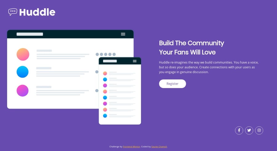
Huddle landing page with single introductory section.
Design comparison
Solution retrospective
I have used flexbox for the project and developed it in my laptop and it is smaller than the actual desktop design. Constructive criticism is most welcome!
Community feedback
- @nityagulatiPosted almost 5 years ago
Hi Saurav, nice work...the site looks good on the laptop. If you want to go a bit further and get the page looking exactly like the design then you can add these few tweaks --
- Add a
box-shadow
andhover
state for the Register button - Currently on the laptop (1220px), the page shows a vertical scroll. To fix that you can resize the image and push the social media and footer sections up to fit everything in single screen frame similar to the design.
Great job on using flex to switch to mobile layout, however there are some scaling issues at the moment.
-
The mobile design isn't scaled down properly. You'll probably have to go back in your media query and resize the elements to better fit the screen size.
-
Also your current media query for
min-width 320px
andmax-width 480px
covers most of the smartphone devices. But I would add couple more breakpoints (as needed) for iPad/tablet devices as well to resize everything accordingly.
Few breakpoints to consider and test
min-width: 576px
//Bootstrap small device breakpoint (landscape phones)min-width: 768px
//iPad devicesmin-width: 992px
//Bootstrap large device breakpoint (desktops)min-width: 1024px
//iPad Pro devicesYou can also check out this extensive list of popular device screen sizes
If you are not using it already, Chrome Developer Tools is a quick and easy way to test and debug different screen breakpoints.
Good luck! :)
1 - Add a
- @omardavidcyberPosted almost 5 years ago
The background image is not showing up because you need to change the url location of the image. You have this:
background: url("/images/bg-desktop.svg");
Its trying to look for it in the css directory so you need to move up one directory.
Change it to this:
background: url("../images/bg-desktop.svg");
1@sauravchamoli17Posted almost 5 years ago@rankupdavid Thanks for reviewing! I've fixed that,check out now and tell me if there's any other mistake I've done.
0
Please log in to post a comment
Log in with GitHubJoin our Discord community
Join thousands of Frontend Mentor community members taking the challenges, sharing resources, helping each other, and chatting about all things front-end!
Join our Discord