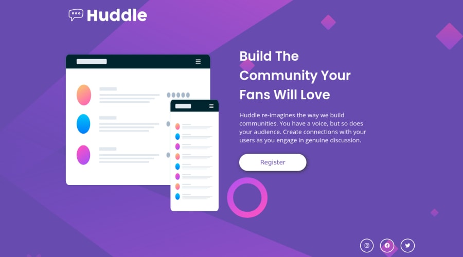
Design comparison
SolutionDesign
Solution retrospective
This website was one of the most challenging website that I came through and the mobile view of this was quite hard and I still expect there should be more things to improve on, Please let me know if there's any fault, Thank you
Please log in to post a comment
Log in with GitHubCommunity feedback
- @kxtara
Hi!!
For accessibility reasons, I suggest you change the
<div>with the class of main to<main>or you can put your code inside of amaintag instead of changing thediv.HAPPY CODING!!!
Join our Discord community
Join thousands of Frontend Mentor community members taking the challenges, sharing resources, helping each other, and chatting about all things front-end!
Join our Discord
