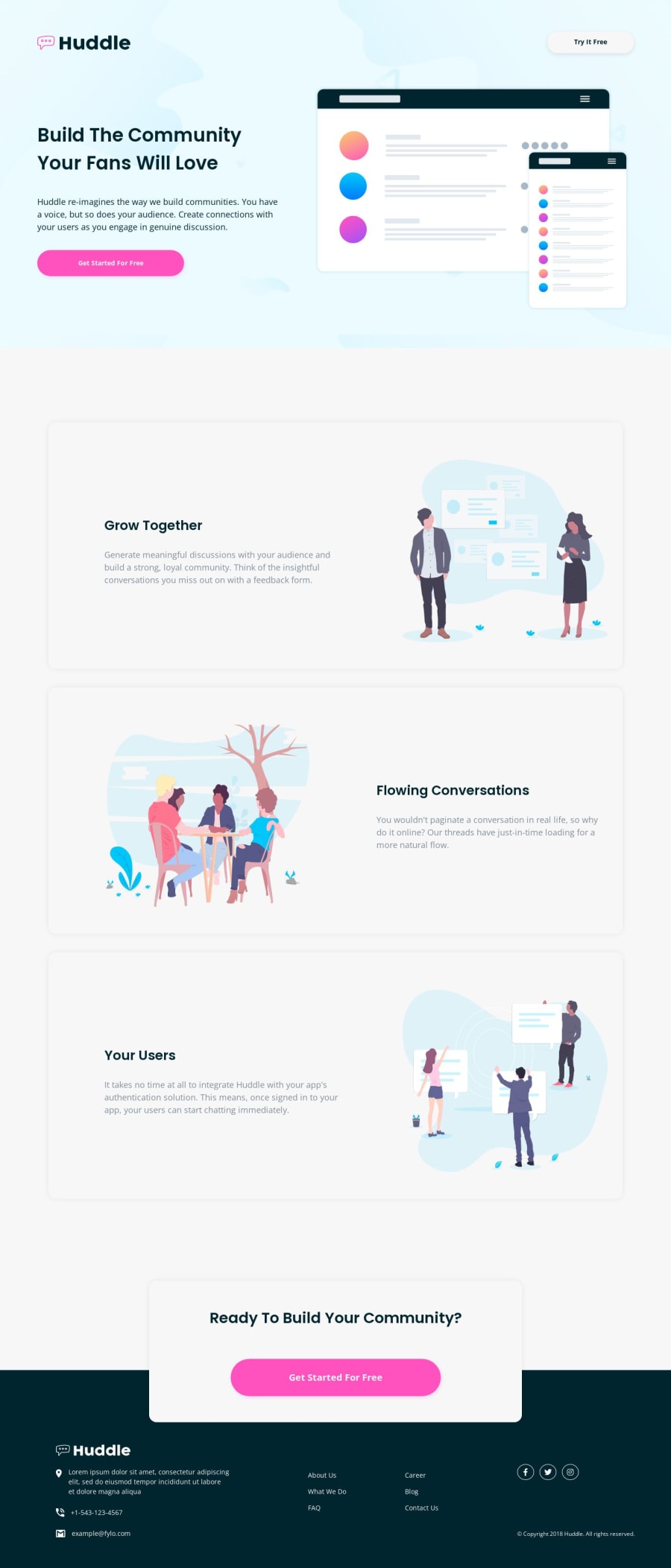
Huddle landing page - with HTML - CSS (Custom properties - Flexbox)
Design comparison
Solution retrospective
hello everyone ;) I wanted to do this challenge as training on building a layout, a little more complex than the single component card I did last time.
it was easy overall, just in some points, such as in the management of the various SVG images present in the "hero section" I had to be a little more careful, to insert them in the right size, or about changing the color of the logo, also in SVG, to place it in the footer, in the end I used another version of the same, changing its color using an external software.
I had one last perplexity when inserting the social icons, always in the footer, as by creating the circular white border, the latter was displayed distorted, based on the proportion of the icon itself;
I fixed it by setting a different "aspect-ratio" than the default one.
Overall it was a fun and useful challenge at the same time, a good workout ;)
Do you think I used a good method to create and manage the layout? let me know in the discussion;
For any feedback/criticism/question I will be happy to answer and discuss it together..good development everyone ;)
Community feedback
Please log in to post a comment
Log in with GitHubJoin our Discord community
Join thousands of Frontend Mentor community members taking the challenges, sharing resources, helping each other, and chatting about all things front-end!
Join our Discord
