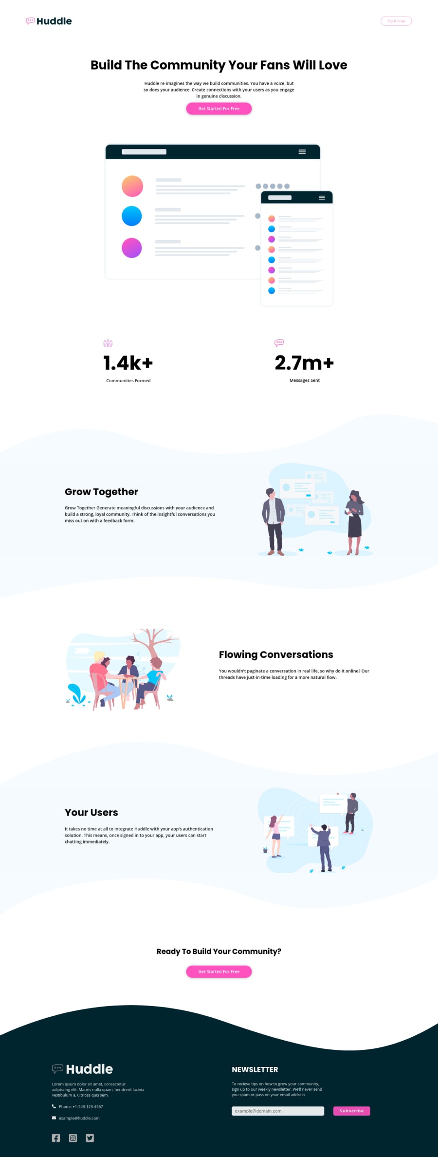
Design comparison
Solution retrospective
How do I solve that accessibility issue? It says should be contained by one main landmark.
All page content should be contained by landmarks
Context:
<div class="left-text">This is my second try. In the previous code, there were some issues that I tried to fix on this site.
Community feedback
- @dwhensonPosted over 3 years ago
Hey @coderSuresh - did you fix the accessibility issue? I can't see any errors. I would imagine that means you had some content outside of a header, main, aside, footer, nav or other landmark?
One suggestion, that might be linked to the error, is to put your
headerandfooterelements at the same level as themainelement. These are landmark roles, and it might make them easier to expose to assistive tech if they are not nested (I don't know this for sure though and haven't checked).One other thing, you might want to think about an approach for stopping the page content from spreading too wide a very large screens. There are many ways to do this but I set a grid on the body element, with three columns, as using a class selector as follows:
.center-content {
	display: grid;
	grid-template-columns: minmax(1rem, 1fr) minmax(375px, 1440px)minmax(1rem, 1fr);
}

.center-content > *  {
	grid-column: 2;
}
The 1440px is the max-width you want the main content to be, and the 1rem values is the smallest spacing you want either side of the main content on small screens (I sometimes put this to 0 and use a container to add padding to each section).
The second part positions all direct children of the body in this nicely sized middle column. In my case, mostly, my header, main, and footer the middle column, and stops them going wider than 1440px. It’s also pretty easy to ‘break’ elements out of this contestant if you need to.
There are other ways to do this, and some people prefer just adding a
max-widthto a container class, but I like the flexibility of this approach.The page looks lovely though and responds well! 👍
Cheers 👋
Dave
Marked as helpful1@coderSureshPosted over 3 years ago@dwhenson Yes, I fixed the issue. Thanks for your comment
0
Please log in to post a comment
Log in with GitHubJoin our Discord community
Join thousands of Frontend Mentor community members taking the challenges, sharing resources, helping each other, and chatting about all things front-end!
Join our Discord
