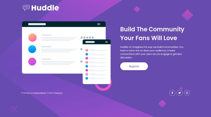
Design comparison
SolutionDesign
Community feedback
- @petritnurediniPosted 10 months ago
Congratulations on completing the 'Huddle landing page with single introductory section' project! Here's some feedback to further enhance your project:
-
HTML & CSS Best Practices:
- Ensure your images have descriptive
alttext for accessibility. - Use
emorremunits instead ofpxfor better scalability and responsiveness.
- Ensure your images have descriptive
-
Responsive Design:
- Test your layout on various screen sizes to ensure a consistent user experience.
- Consider using CSS Flexbox or Grid for more flexible and efficient layout design.
-
Performance Optimization:
- Optimize your images for faster load times, especially for mobile users.
- Minimize the use of large background images for mobile devices to improve performance.
-
Code Organization:
- Keep your CSS organized by grouping similar styles together and commenting on different sections.
- Regularly format your HTML and CSS for better readability and maintenance.
-
Accessibility Focus:
- Check color contrast to ensure text is easily readable against the background.
- Use semantic HTML elements to improve the structure and accessibility of your webpage.
-
Learning Resources:
- For responsive web design techniques: Responsive Web Design Basics
- To learn more about CSS Flexbox: A Complete Guide to Flexbox
Your progress is impressive! Keep up the great work and continue challenging yourself with new projects. 🌟
Marked as helpful0 -
Please log in to post a comment
Log in with GitHubJoin our Discord community
Join thousands of Frontend Mentor community members taking the challenges, sharing resources, helping each other, and chatting about all things front-end!
Join our Discord
