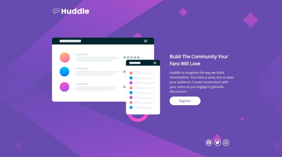
Design comparison
SolutionDesign
Solution retrospective
What are you most proud of, and what would you do differently next time?
If i get the chance, I'll be redoing this project. i did'nt get the layout spacing properly. Next i'll stick to native CSS rather trying to solve it with bootstrap, which i didn't go through with anyway but got confused instead.
What specific areas of your project would you like help with?Any suggestions on how i can size the image properly when using flexbox will be highly appreciated.
Community feedback
Please log in to post a comment
Log in with GitHubJoin our Discord community
Join thousands of Frontend Mentor community members taking the challenges, sharing resources, helping each other, and chatting about all things front-end!
Join our Discord
