Submitted over 2 years agoA solution to the Huddle landing page with curved sections challenge
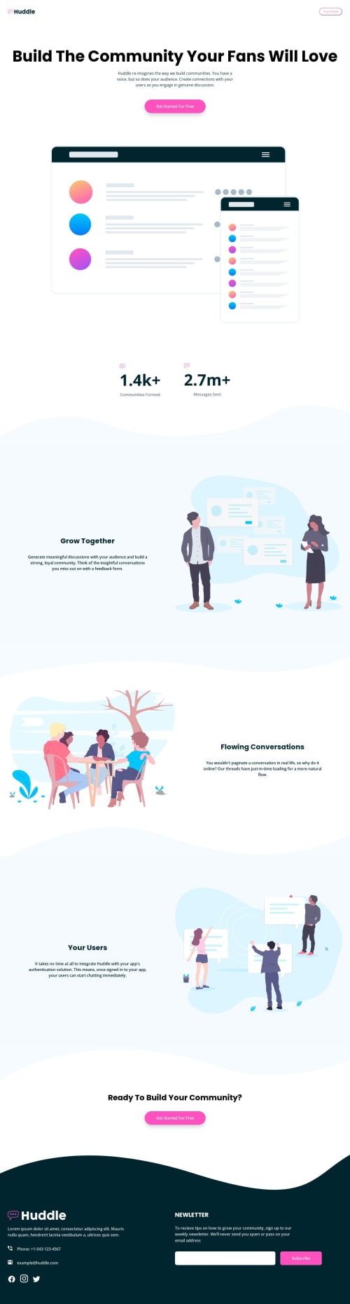
Huddle landing page with curved sections

@younesadjoudj
Solution retrospective
Hi guys! To add the curved style to sections, I used the pseudos elements ::before and ::after (you can see the code right below here), it worked, but I struggled to do it but it's not really 100% responsive, I had to adjust by adding a height in absolute units (px) to fix everything. If you know a better, simpler and more responsive way, I'm interested. Thank you
/* Waves (curves) styling */
.grow, .users, footer {
    position: relative;
}

.grow::before, .grow::after,
.users::before, .users::after,
footer::before {
    content: '';
    width: 100%;
    position: absolute;
    left: 0;
    background-repeat: no-repeat;
    background-size: cover;
}

.grow::before {
    height: 250px;
    bottom: 100%;
    background-image: url("images/bg-section-top-mobile-1.svg");
    background-position: center;
    margin-top: 4rem;
}

.grow::after {
    height: 150px;
    top: 100%;
    background-image: url("images/bg-section-bottom-mobile-1.svg");
    background-position: center;
}

.users::before {
    height: 120px;
    bottom: 100%;
    background-image: url("images/bg-section-top-mobile-2.svg");
}

.users::after {
    height: 150px;
    top: 100%;
    background-image: url("images/bg-section-bottom-mobile-2.svg");
}

footer::before {
    height: 200px;
    bottom: 100%;
    background-image: url("images/bg-footer-top-mobile.svg");
}
Code
Loading...
Please log in to post a comment
Log in with GitHubCommunity feedback
No feedback yet. Be the first to give feedback on Younes Adjoudj's solution.
Join our Discord community
Join thousands of Frontend Mentor community members taking the challenges, sharing resources, helping each other, and chatting about all things front-end!
Join our Discord