Submitted almost 2 years ago
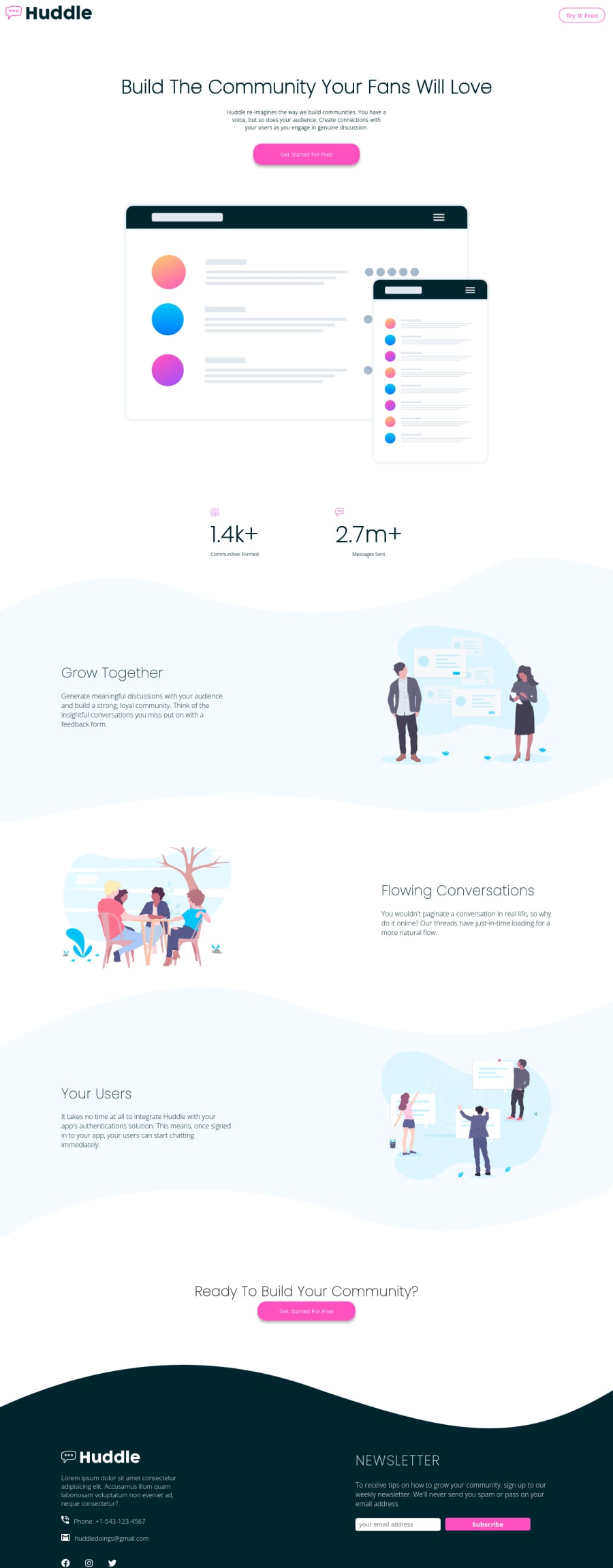
Responsive landing page using css grid and flexbox
@JerryJeager
Design comparison
SolutionDesign
Community feedback
- @VCaramesPosted almost 2 years ago
Hey there! 👋 Here are some suggestions to help improve your code:
- It is best practice to use, classes for your naming convention as classes are reusable, making them ideal for CSS styling. IDs on the other hand, are not reusable and are mainly used for JavaScript.
- The logo is not not decorative, Its
alt tagshould not be blank. The description should state the company’s name.
- Your **use of headings is incorrect.**The
h1heading is only allowed to be used once per page.
- Along with the blank
alt tag, you also want to include thearia-hidden=“true”to your Illustrations to fully remove them from assistive technology.
More Info:📚
https://www.w3.org/WAI/tutorials/images/
- Remove all the
brelements you added, they are unnecessary.
- Your
inputshould have a visually hiddenlabelto improve accessibility.
- To not only improve your HTML code but to also identify the main content of you page, you will want to wrap the main content of your site inside the
mainelement.
More Info:📚
- The phone and address on the
footershould be wrapped in Anchor Tags and set the href in the following manner so users can click on them and the phone/email app can open automatically:
Phone:
<a href="tel:+1-543-123-4567">Phone: +1-543-123-4567</a>Email:
<a href="mailto:[email protected]">[email protected]</a>More Info:📚
If you have any questions or need further clarification, feel free to reach out to me.
Happy Coding!🎄🎁
Marked as helpful0
Please log in to post a comment
Log in with GitHubJoin our Discord community
Join thousands of Frontend Mentor community members taking the challenges, sharing resources, helping each other, and chatting about all things front-end!
Join our Discord
