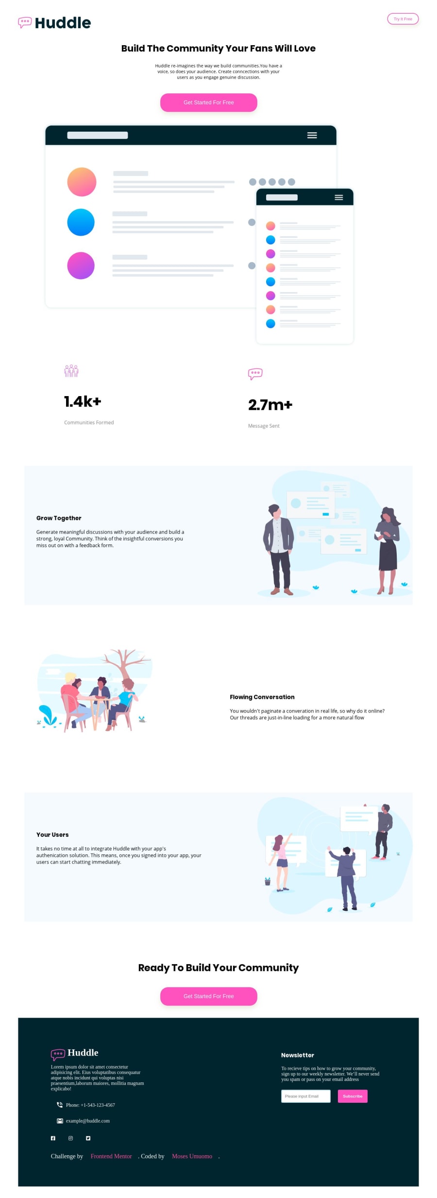
Design comparison
Solution retrospective
I don't know how to design the grow together section, your users and contact us with the svg...
Community feedback
- @ovidiuantonioPosted over 4 years ago
Hello, nice solution so far! To design these sections you can add the specific 'wavy images' as ``background-image
to the previous and next section, and then position it the way it should widthbackground-position``` property.For example, to design the 'your users' section you will use two background images, one on the 'flowing conversations' section (positioned to the bottom), and one on the 'ready to build your community' section (at the top).
You can add multiple background-images the the same time by using
background-imageproperty like this:background-image: url(urlImage1), url(urlImage2), and to align them you usebackground-position: positionImage1, positionImage2.Happy coding! Keep going!
1
Please log in to post a comment
Log in with GitHubJoin our Discord community
Join thousands of Frontend Mentor community members taking the challenges, sharing resources, helping each other, and chatting about all things front-end!
Join our Discord
