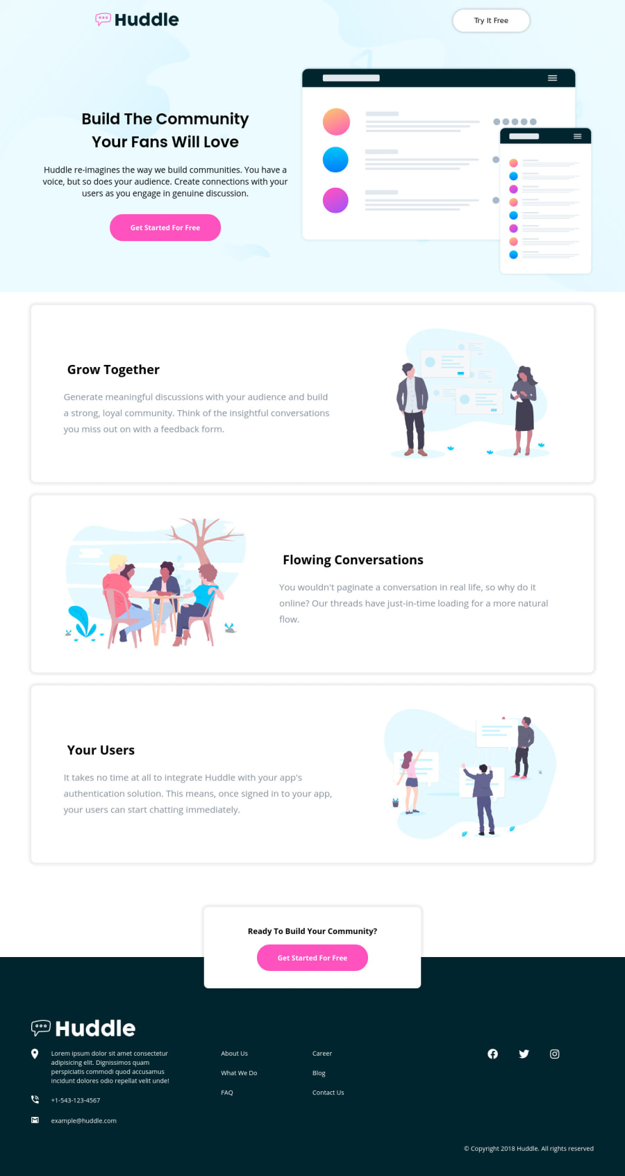
Design comparison
Solution retrospective
Hi,
I used this project to get practice with SASS and improve my responsiveness skill. Any advice to get my CSS more dry would be appreciated.
Many Thanks.
D.
Community feedback
- @DesignAssemblyPosted over 3 years ago
Welldone on completeing th challenge! I have a couple of suggestions to help you improve your code and representation thereof. Let's start with the most glaring issue as this creates a huge visual difference in the design - the box-shadows. Look at the design and look at your solution. you need to lower the opacity of your shadow quite a bit to give it a more subtle look. this will improve your design drastically. Next, I would suggest setting your wrapper div to a max-width of 1440px, the same as you have for the footer. Apply the same to your header tag.
the Header - I would suggest only have the logo and the "try free " button in there. Split the rest out into its own "hero" section, and put the background image on the hero section. then add position absolute to the header so you have the new "hero" section align to the top of your page.
Check your text alignment on desktop - should not be left-align instead of center-aligned.
From an Scss point of view, your specificity level is exceptionally deep. My suggestion here would be to think of each item as a component. in another word "can you strip it out with only its piece of HTML and SCSS and place it in another file and it would render almost exactly the same? example of this would be your "box" components. Kick-off your SCSS for this component apply this class only to these 3 elements and nothing else ie:
.box { background: white; padding: 2rem; box-shadow: 0 0 20px rgba(0,0,0,.2); display: flex; flex-direction:row; &__inner { display: flex: flex-direction: column; &--left { text-align: left; ... } } }
as you can see no need to refer to the body tag or a div tag, you already have a class to that div tag. keep it at the component level. create good class names - read up on BEM model. great info on structuring your classes and CSS
other that that good job, and well done
0
Please log in to post a comment
Log in with GitHubJoin our Discord community
Join thousands of Frontend Mentor community members taking the challenges, sharing resources, helping each other, and chatting about all things front-end!
Join our Discord