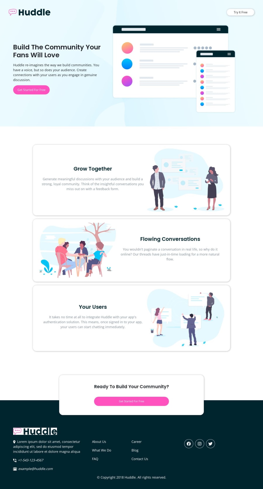
Design comparison
SolutionDesign
Solution retrospective
Hey! Could you give me your feedback please? I did this project some time ago, but only now am I uploading it to the platform and I am resuming my studies on Web tools.
Any suggestions for improving it will be most welcome.
Community feedback
- @ChamuMutezvaPosted over 1 year ago
Hi Lucas Kalks
After going through your project, here are some recommendations:
- use landmarks and semantic HTML always , ahead of such elements as divs. You can find out more on landmarks and semantic HTML on MDN docs. But in short landmarks and semantic HTML helps in creating an accessible website. The
main
element consist of content that is dominant in the site - hence this is one of the elements that should always be in a site. - heading elements should follow a sequential order , with the
h1
being the first heading element . - the
try it free
button, looks like it should have been an anchor element. Research on the difference between button and anchor. - interactive elements such as button and anchor elements should be supported by text that is available to assistive technology users. This is in reference to the following
<a href=""><i class="botao-rodape fa-brands fa-lg fa-facebook"></i></a>
- font sizes should not be written in px values, the following article gives you the reasons why Why font-size must NEVER be in pixels
- declaration like the following
footer ul li a:hover
should be avoided - not easy to maintain. The anchor element can just have a class that can be used for styling
0 - use landmarks and semantic HTML always , ahead of such elements as divs. You can find out more on landmarks and semantic HTML on MDN docs. But in short landmarks and semantic HTML helps in creating an accessible website. The
Please log in to post a comment
Log in with GitHubJoin our Discord community
Join thousands of Frontend Mentor community members taking the challenges, sharing resources, helping each other, and chatting about all things front-end!
Join our Discord