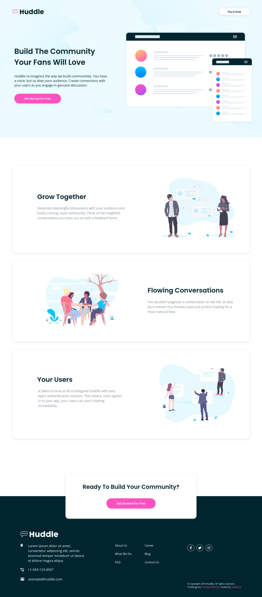
Design comparison
SolutionDesign
Community feedback
- @protondkPosted over 2 years ago
Looks just like the design. I was looking through the code and I noticed great use of semantic HTML. Also responsiveness is great on all devices. The buttons on your solution seem to be a little smaller than the original designs and that is something I would try to be careful of in the future.
The cards featuring information look great and almost as the original design.
Marked as helpful1
Please log in to post a comment
Log in with GitHubJoin our Discord community
Join thousands of Frontend Mentor community members taking the challenges, sharing resources, helping each other, and chatting about all things front-end!
Join our Discord
