Submitted about 2 years ago
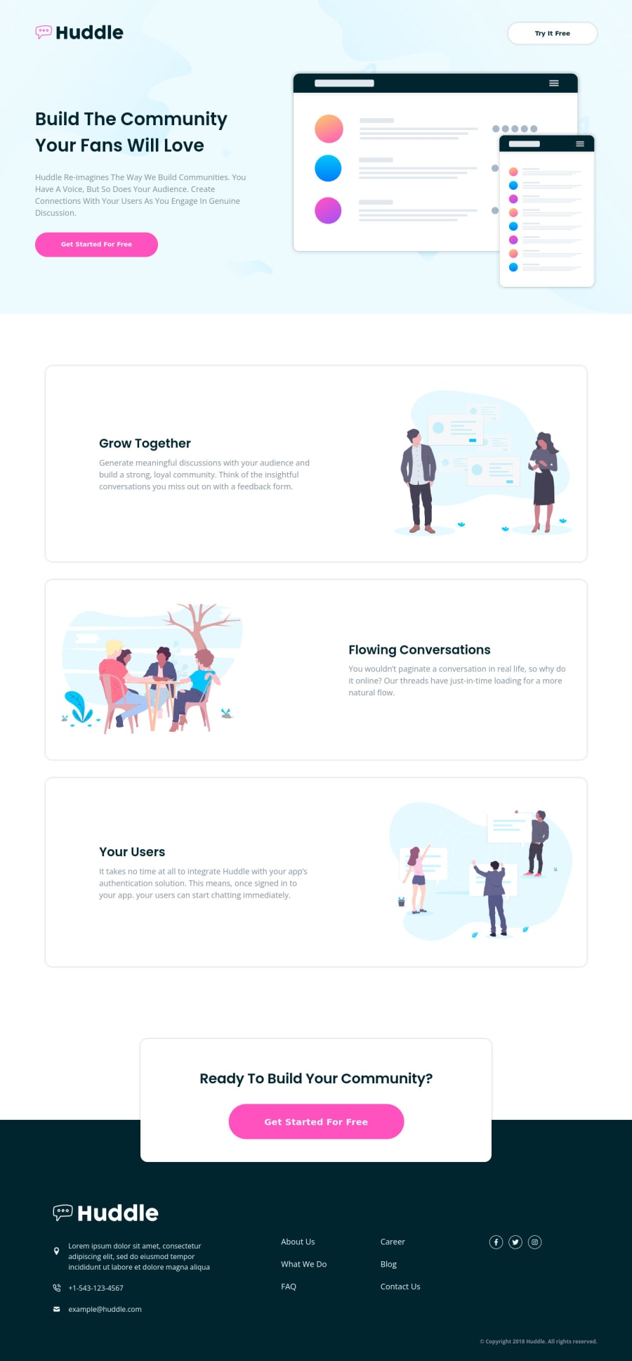
Huddle landing page with alternating feature blocks
@Akhlak-Hossain-Jim
Design comparison
SolutionDesign
Solution retrospective
Here is the solution I came up with, please leave your feedback.
Community feedback
- @hyrongennikePosted about 2 years ago
Hi @Akhlak-Hossain-Jim,
Awesome job on the challenge
This is just a suggestion and taking into the width provided in the style guide. Instead of add the
max-width: 1440pxon the main .hndGxX you can remove that rule and add the 1440px everything you usedmax-width: 1328px;andmax-width: 1281px;that way the header and footer backgrounds span the full width on larger screen it just looks cleaner.You have to do the same for the footer might have to use
justify-content: space-between.Hope this is helpful.
0
Please log in to post a comment
Log in with GitHubJoin our Discord community
Join thousands of Frontend Mentor community members taking the challenges, sharing resources, helping each other, and chatting about all things front-end!
Join our Discord
