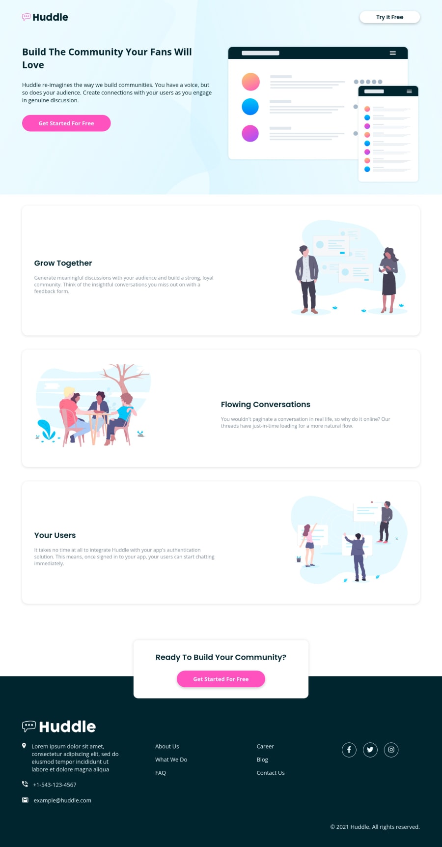
Huddle landing page with alternating feature blocks using SCSS
Design comparison
Solution retrospective
Your feedback is useful for me :).
Community feedback
- @brodiewebdtPosted almost 3 years ago
This looks very good. Totally responsive. There are errors in the report above. You have H3 and P inside a span which isn't valid HTML. Change the Spans to Divs and that should take care of the errors. I don't think it will change the layout at all.
With the accessibility warnings, you skip from an H1 to an H3. You don't want to skip levels. You can change the styles to look however you want. If you add an Aria-Label to the icon links in the footer, that will clear the rest of them. I add an aria-label="Twitter link" or whichever icon it is. Download AXE DevTools and you can check accessibility while you are coding. https://www.deque.com/axe/devtools/
Hope this helps.
0@mohamadadithyaPosted almost 3 years ago@brodiewebdt Thanks for your feedback, it's help me to understand HTML accessibility.
0
Please log in to post a comment
Log in with GitHubJoin our Discord community
Join thousands of Frontend Mentor community members taking the challenges, sharing resources, helping each other, and chatting about all things front-end!
Join our Discord